2026
Provet
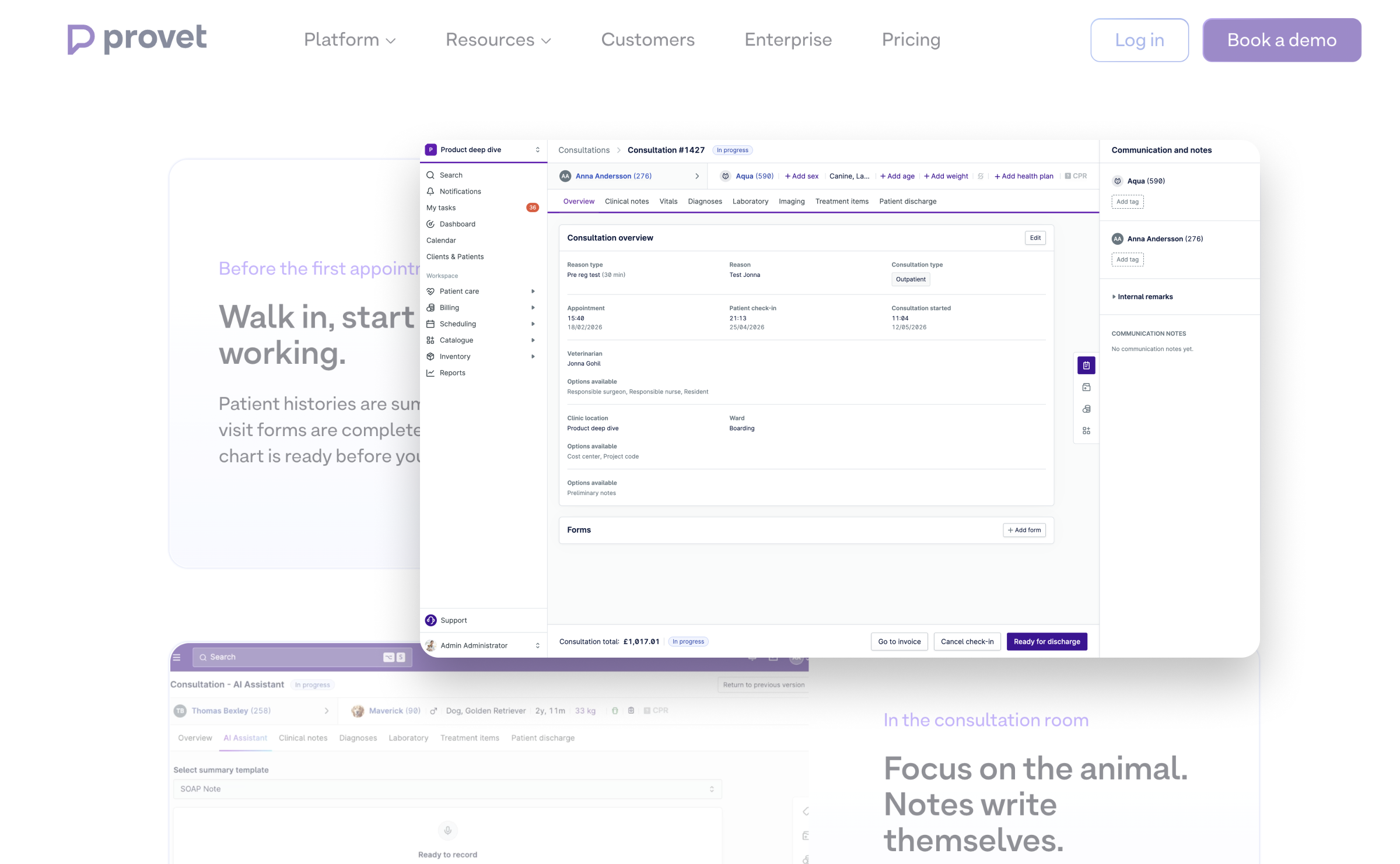
Since 2021, I've been designing for Provet, clinic management software that helps vets spend less time fighting their computers and more time helping animals. Complex clinical workflows, now with fewer headaches.
UI/UX + Product 2026
Use arrow keys to navigate between projects


Since 2021, I've been designing for Provet, clinic management software that helps vets spend less time fighting their computers and more time helping animals. Complex clinical workflows, now with fewer headaches.
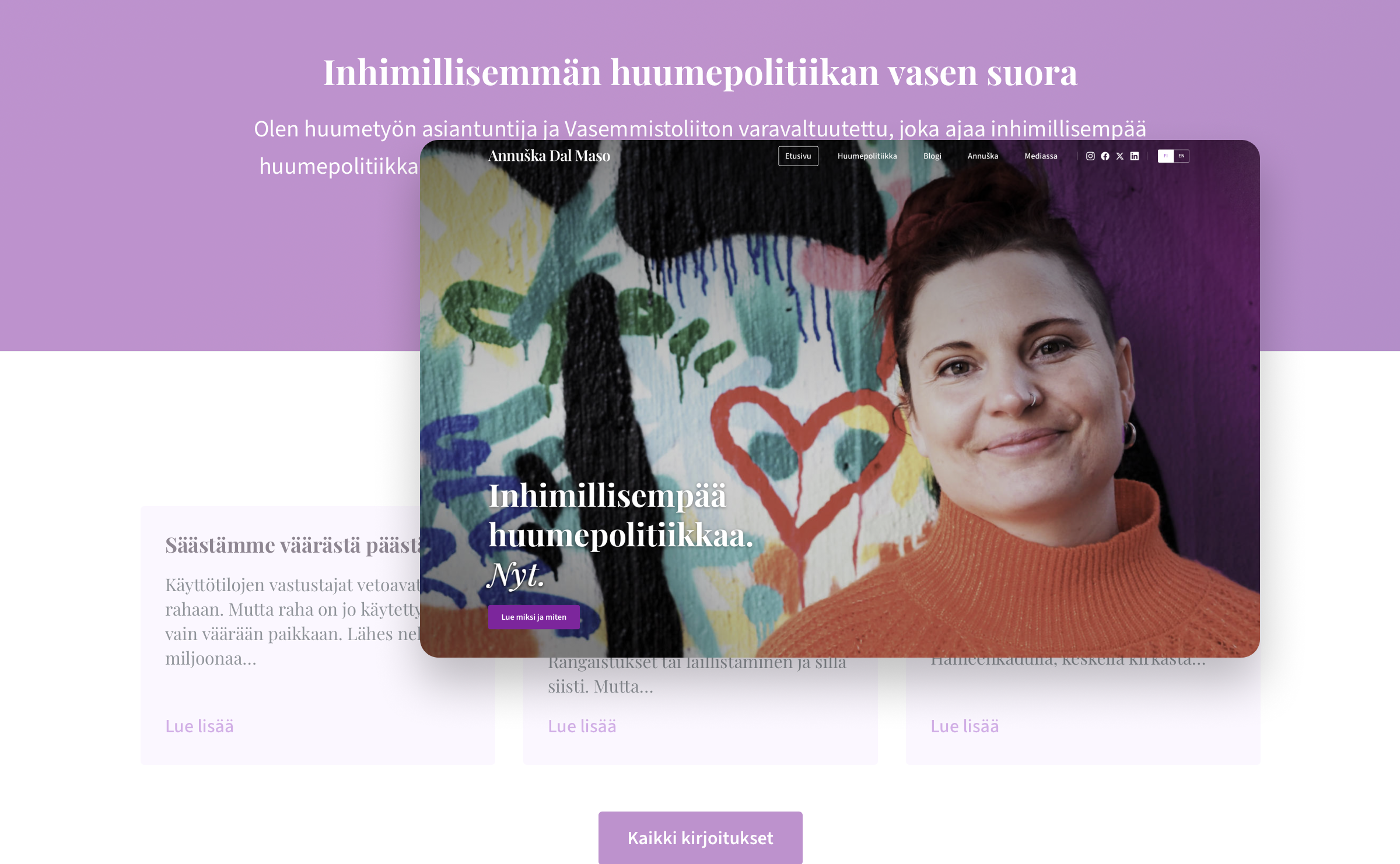
A visual identity and website for a drug policy expert with real things to say. The kind of work where the content actually matters.
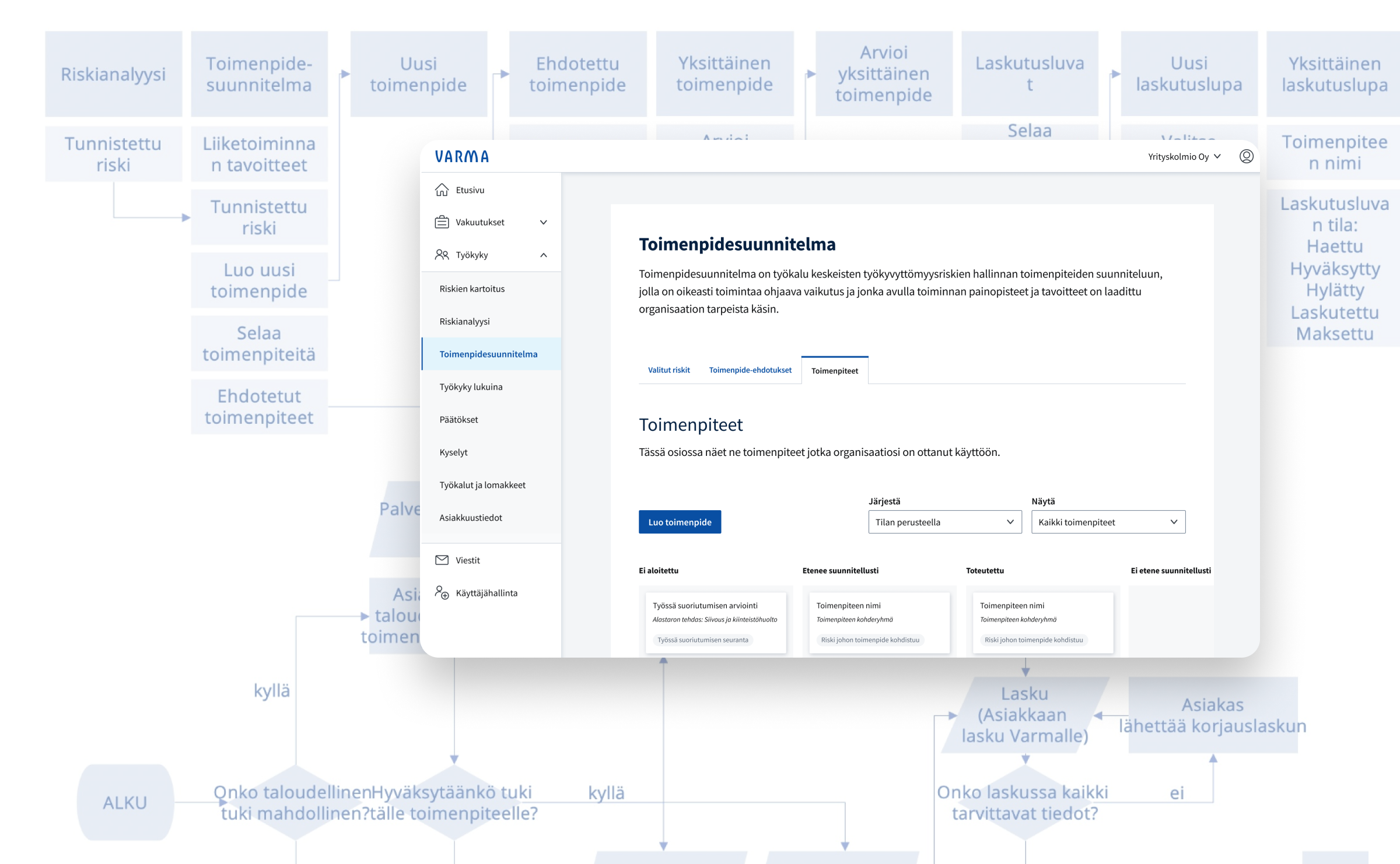
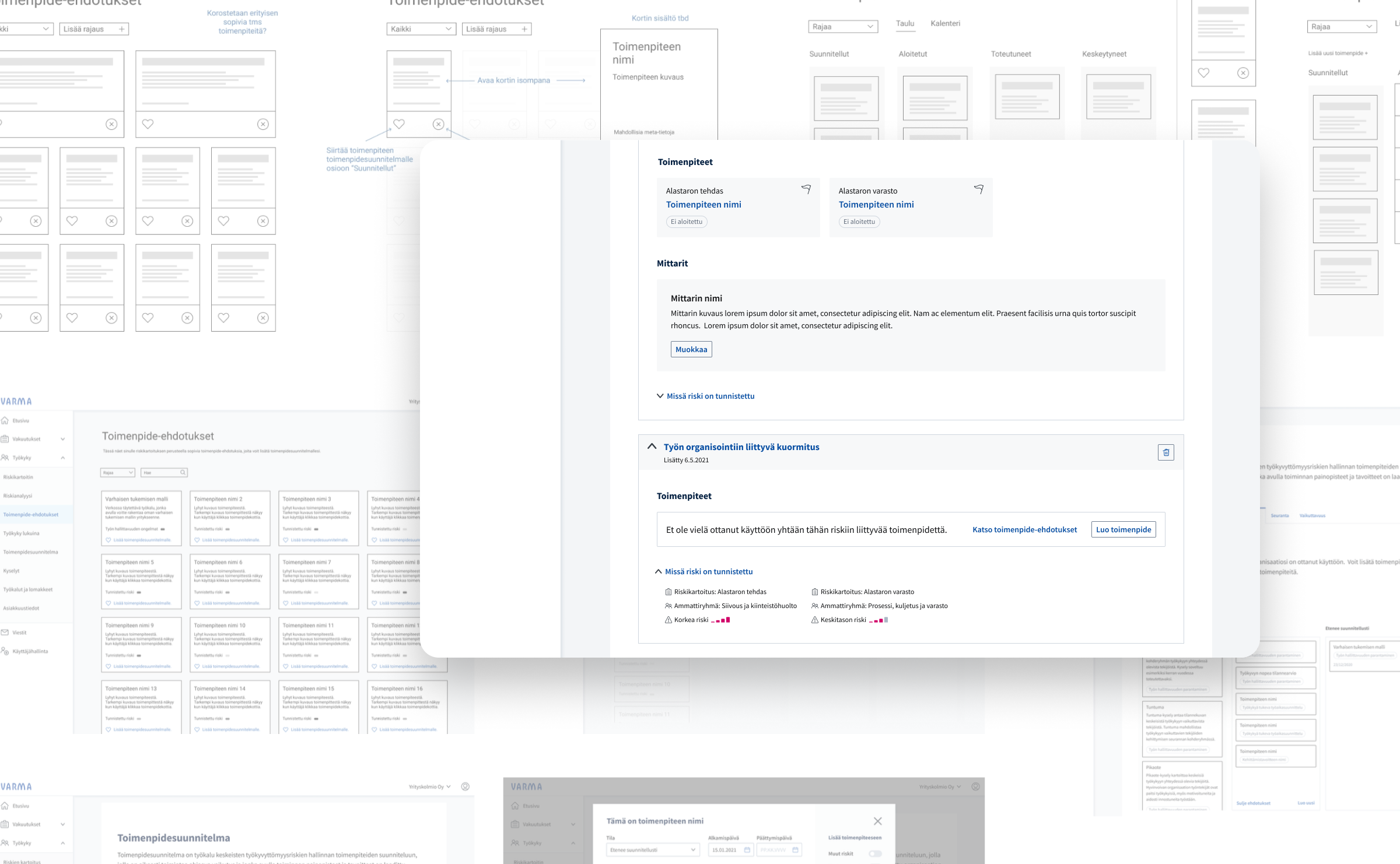
Regulators changed the rules, a pension insurance company found itself in chaos, and I got a call. On a tight deadline I translated vague executive ideas into a real, user-tested product.
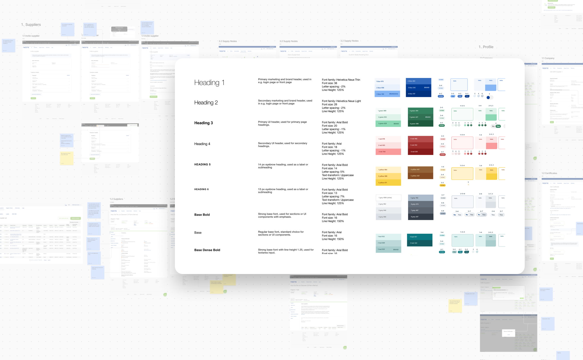
Neste's supply chain sustainability portal had grown… organically, let's say. I brought order to the chaos by building a design system from scratch and rolling it out across the product one touchpoint at a time.
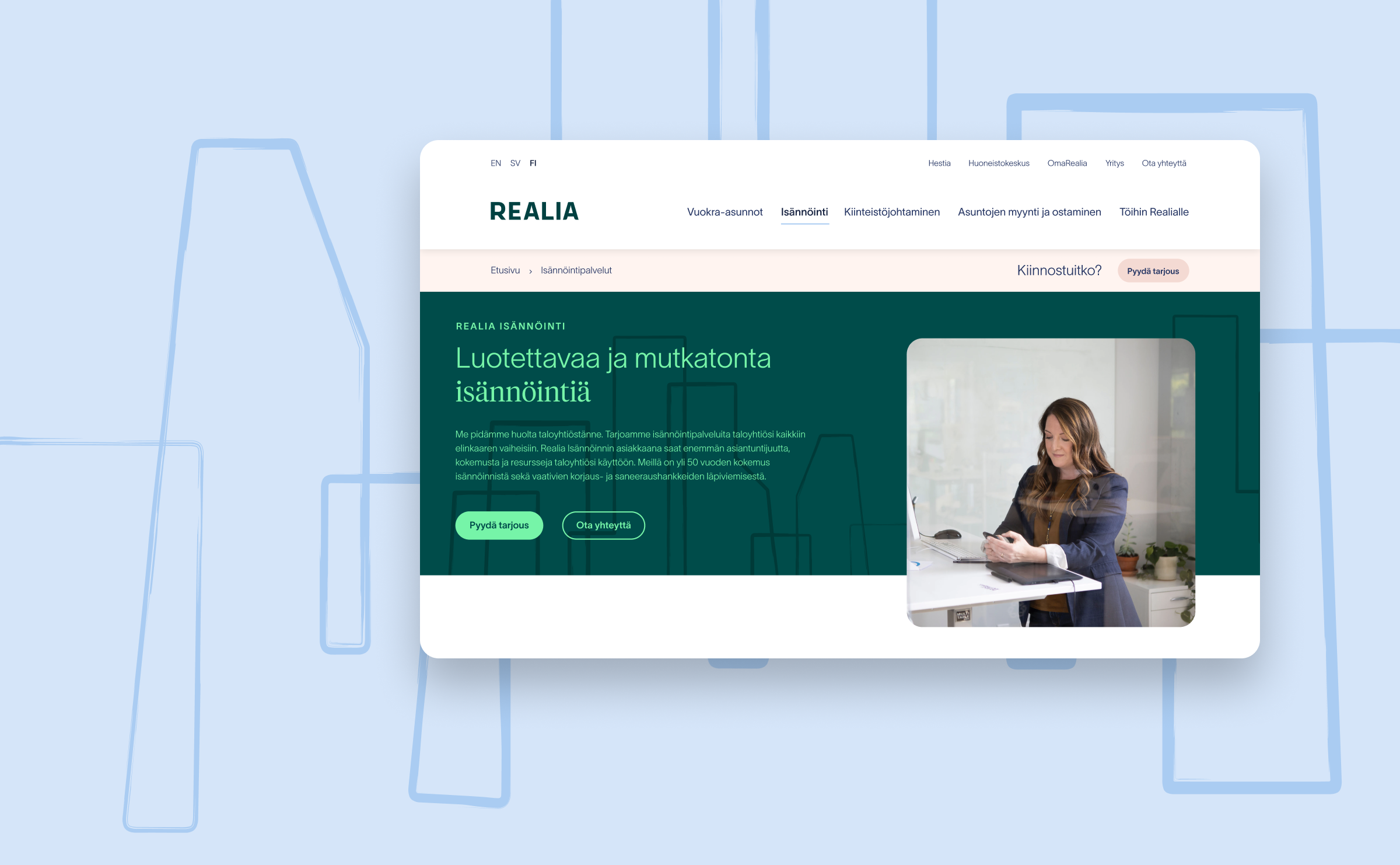
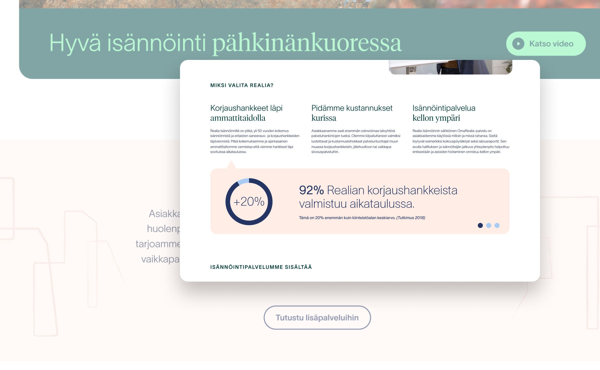
National property manager decided it was time for a new look. We built clean, modern website to match and designed to convert visitors.
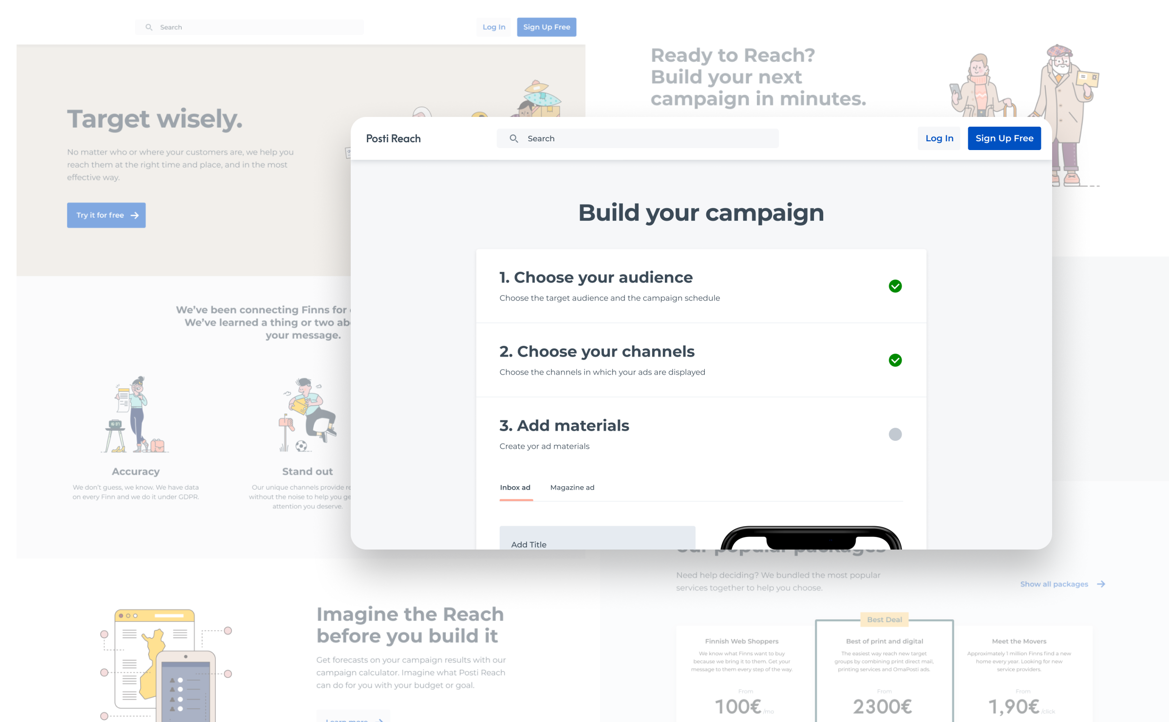
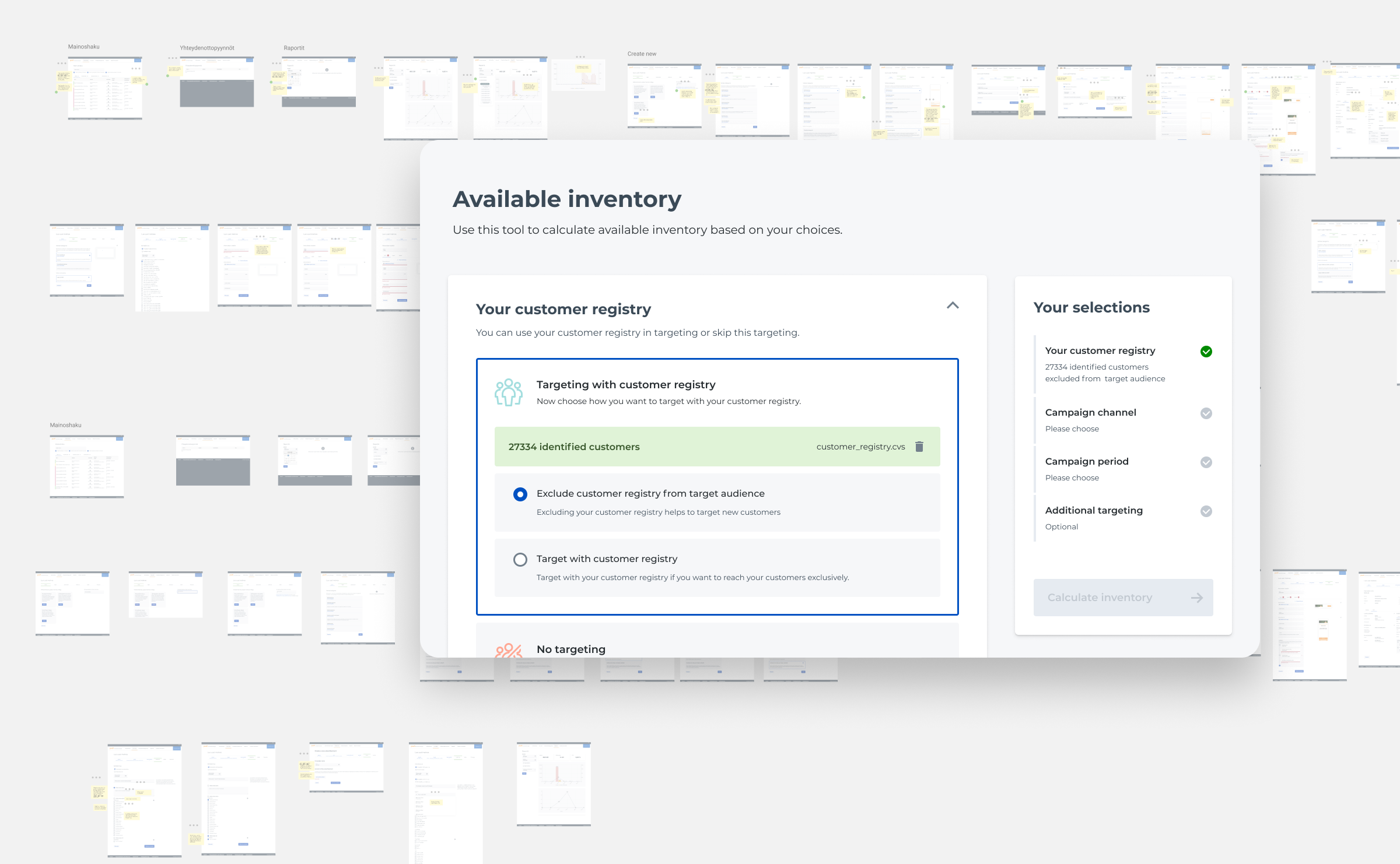
Finland's postal service wanted to know what comes next. I helped turn their existing tools into proper self-service experiences and prototyped a whole new business area they were about to step into.
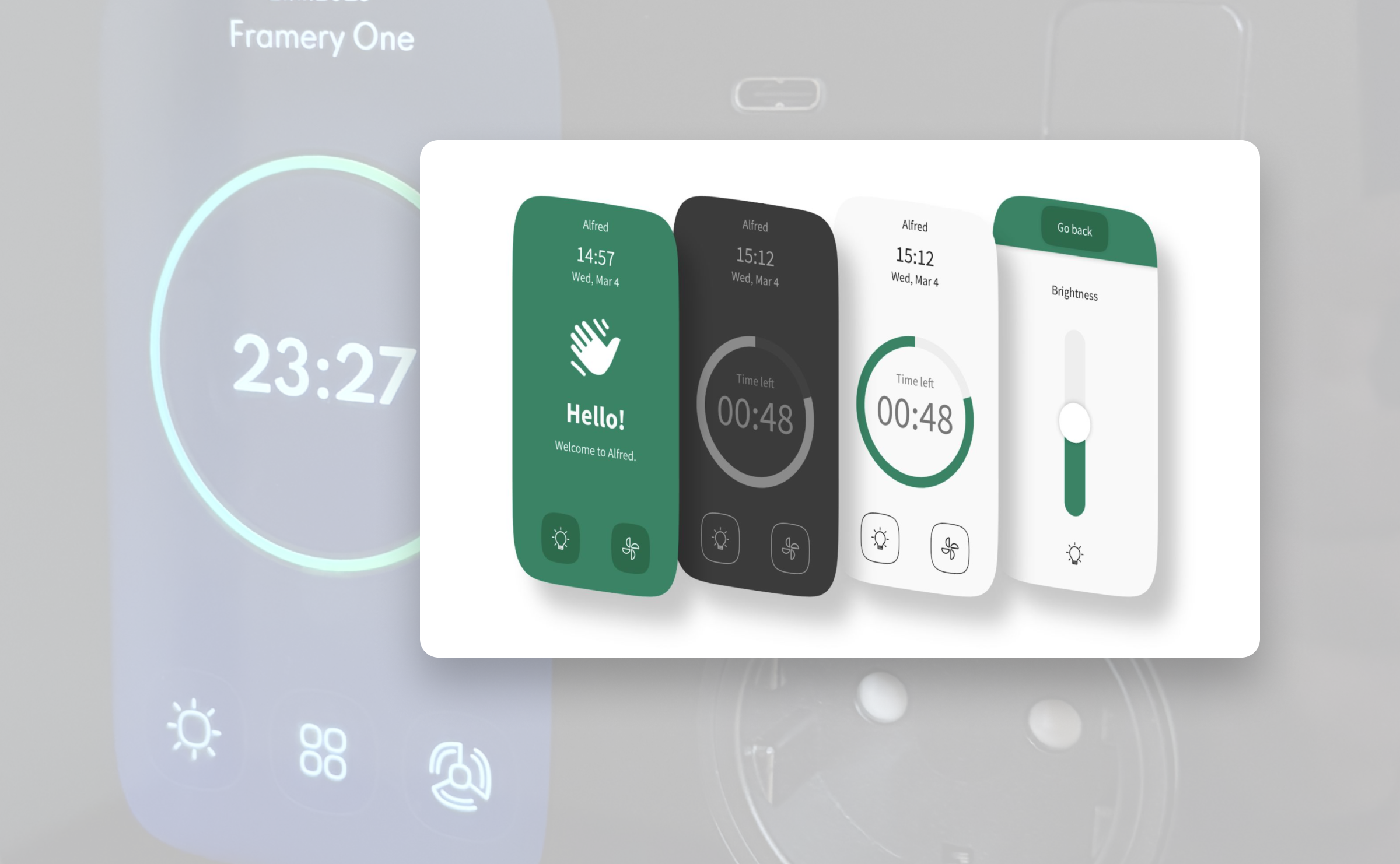
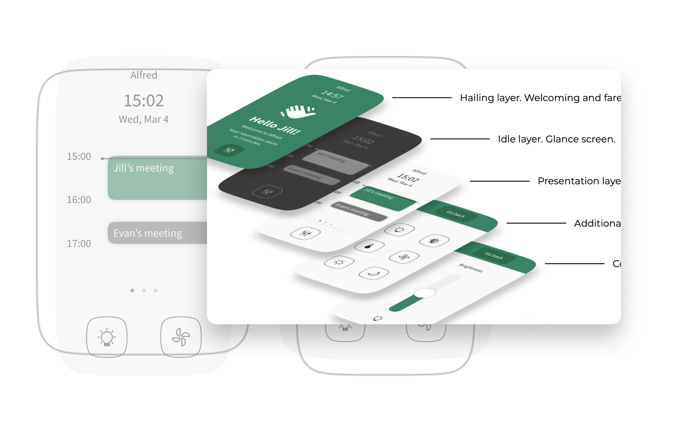
Framery makes those little office pods where you can take calls without your colleagues overhearing. I helped to design the control panel, which is that thing you tap when you want more light, less noise, or just to feel like you're piloting a spaceship.
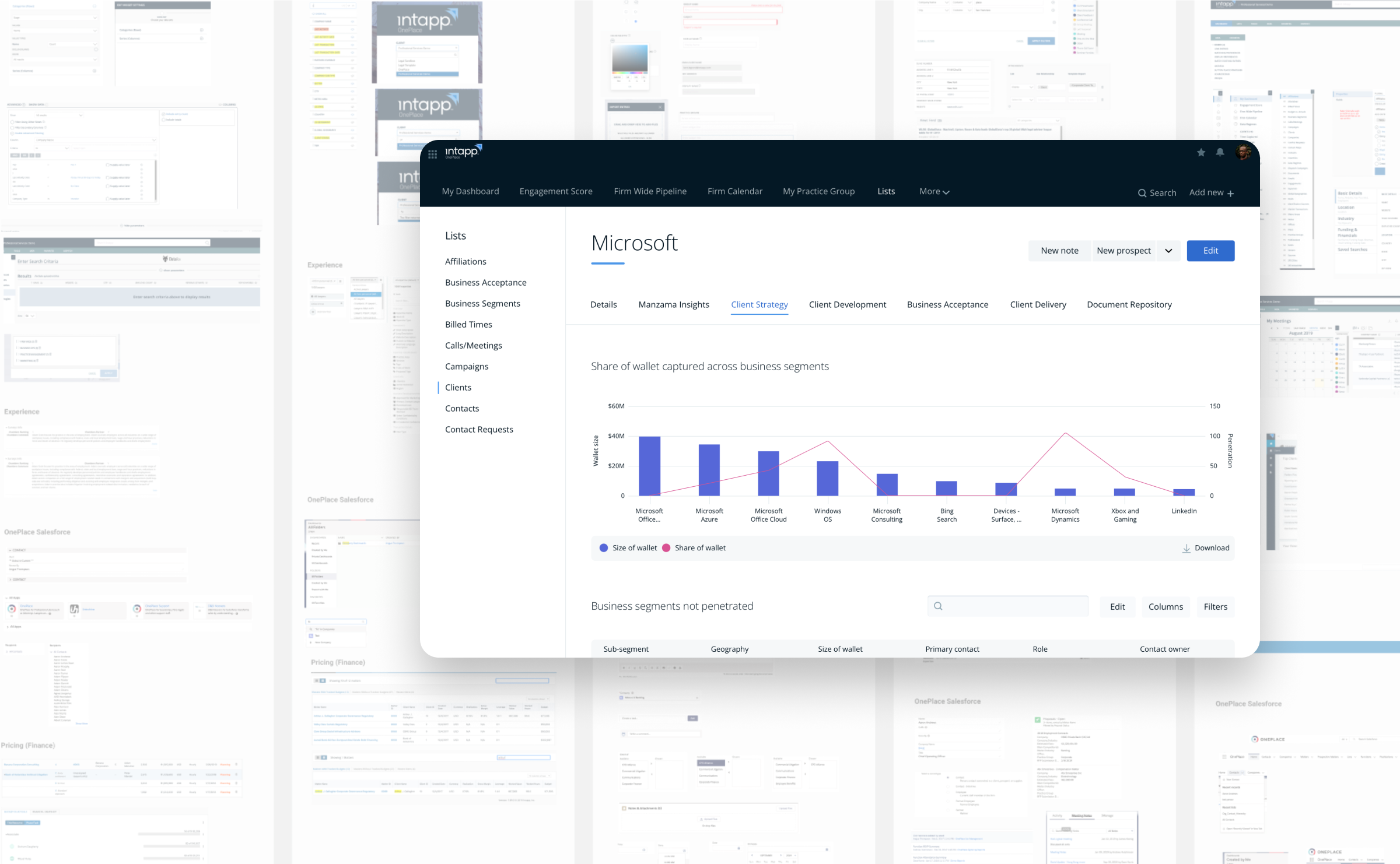
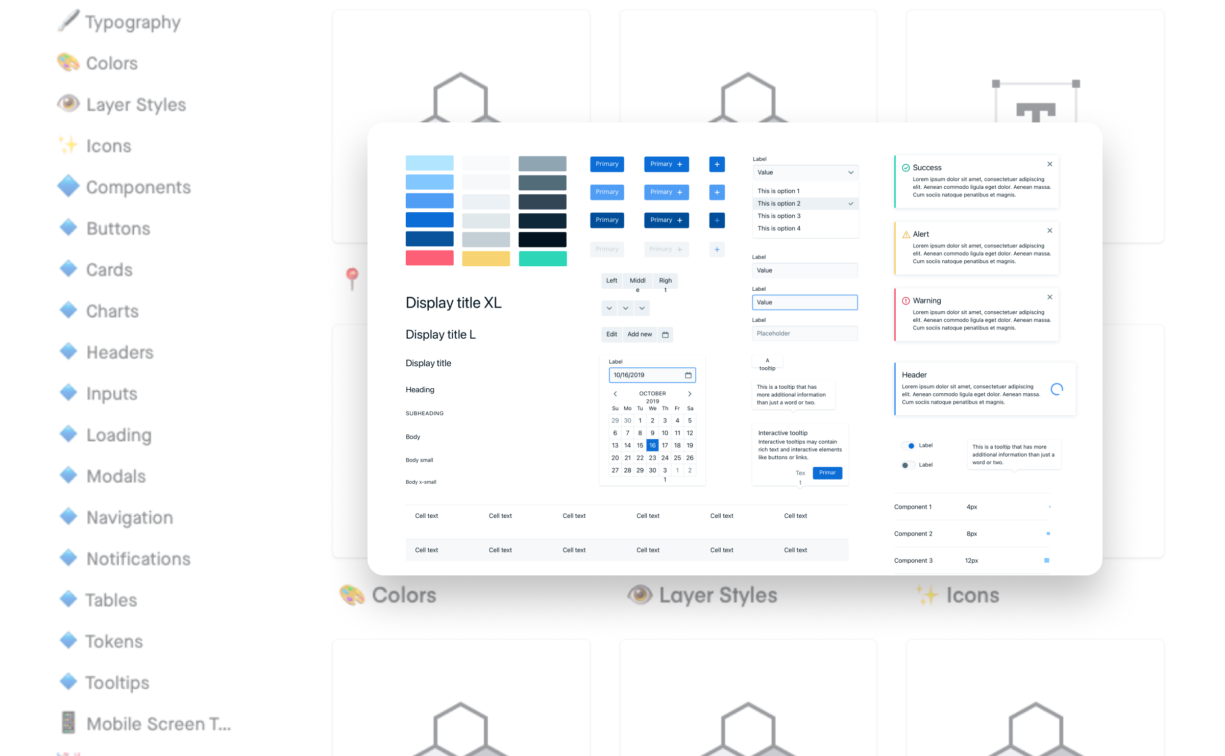
Legal and financial software tends to look like it was designed in 2004 — because it was. We fixed that for Intapp, building a design system that modernized their whole product suite and got the executives nodding in approval.
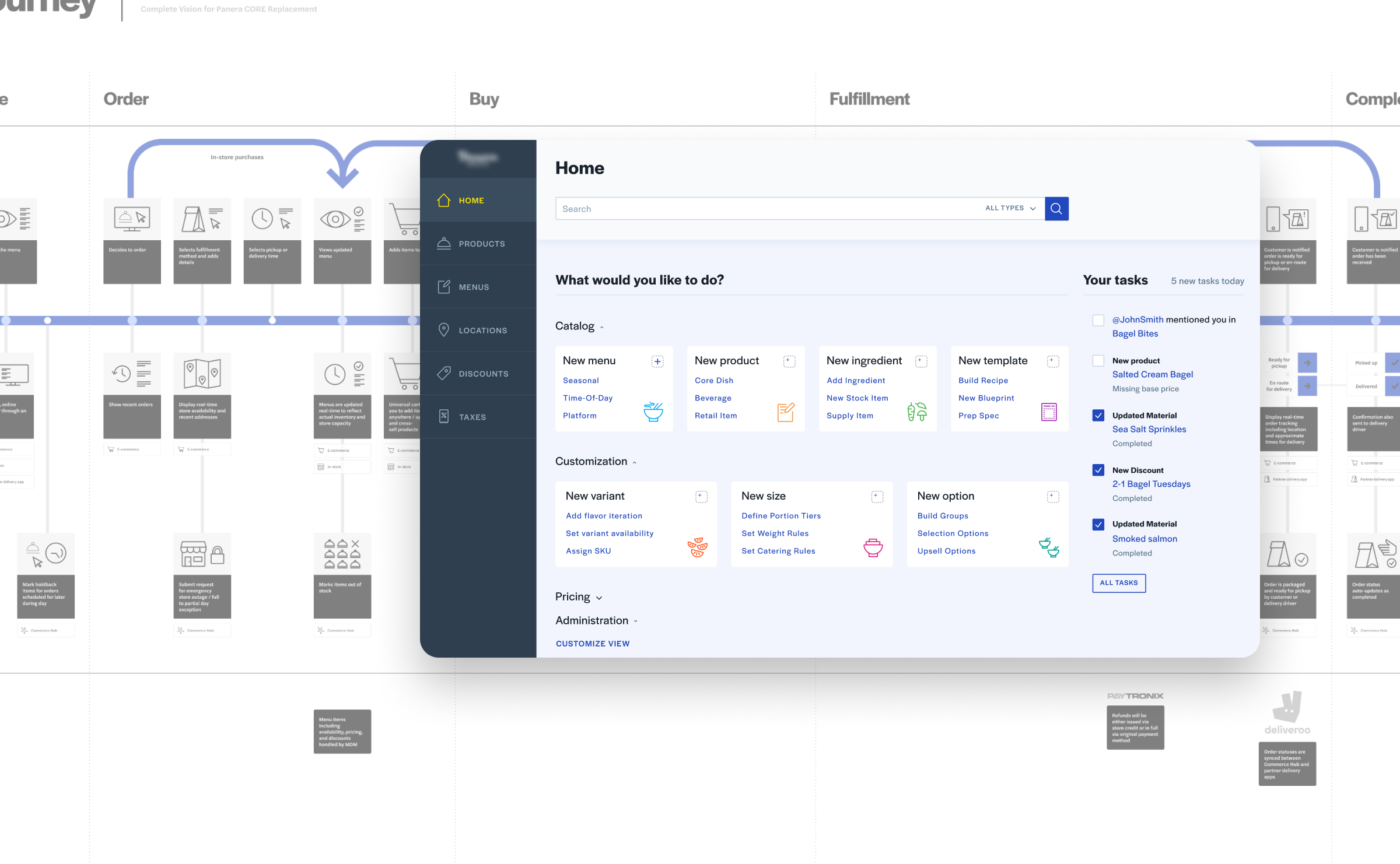
Panera Bread wanted to go B2B. We built the product concept, where I focused on visual identity and design system for their new enterprise service that helps restaurant managers wrangle inventory without wanting to throw their laptops out the window.
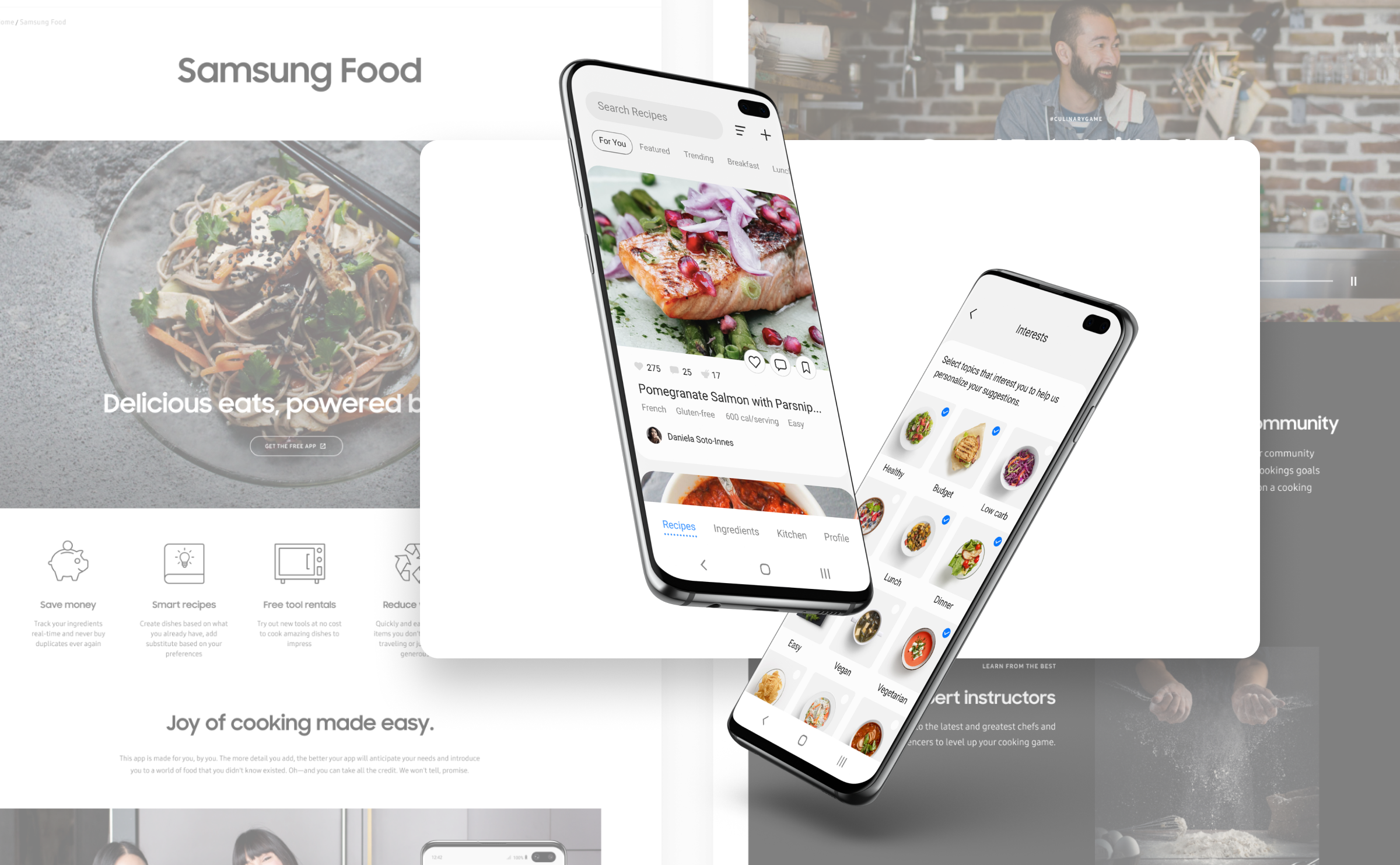
Samsung wanted a vision for the kitchen of the future, where your fridge knows you're out of milk and your oven does what it's told. I led the visual design to make that concept feel genuinely real.
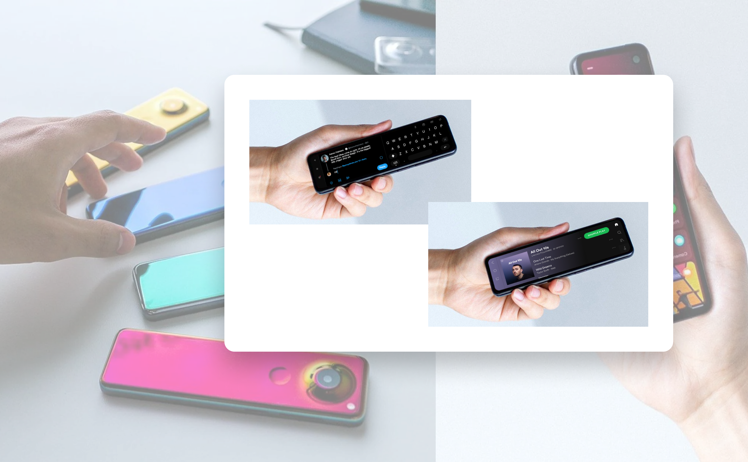
Essential's Project Gem was a phone unlike any other: tall, thin, and rotated sideways from everything you know. I helped rethink how apps should work on a device that broke every design assumption we had going in.
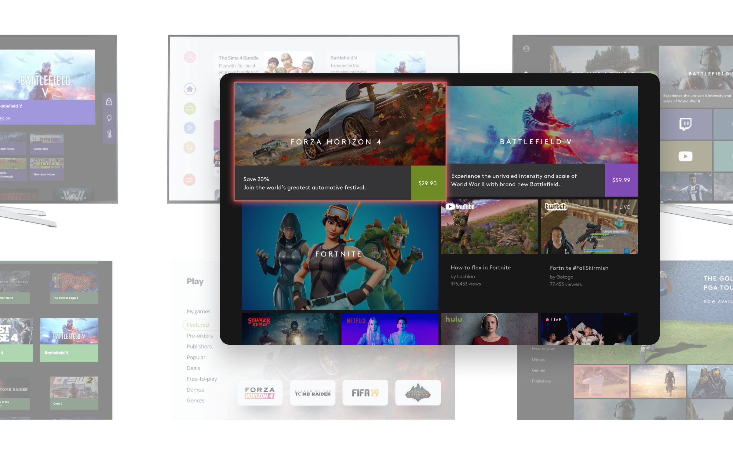
A confidential project for a major telco building a hybrid device that was part PC, part games console, and entirely experimental. I shaped the visual language and interface concepts for something that had never existed before.
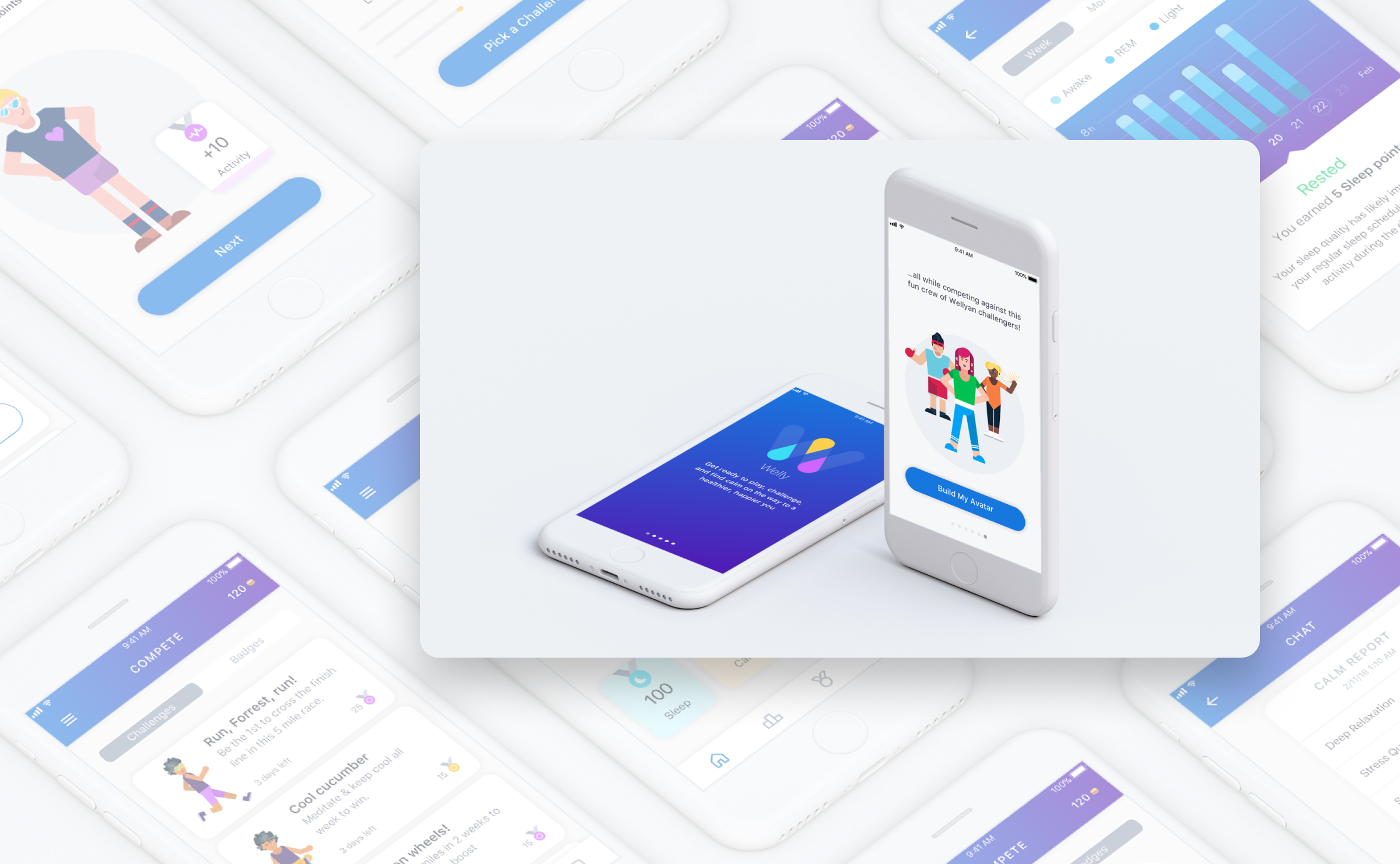
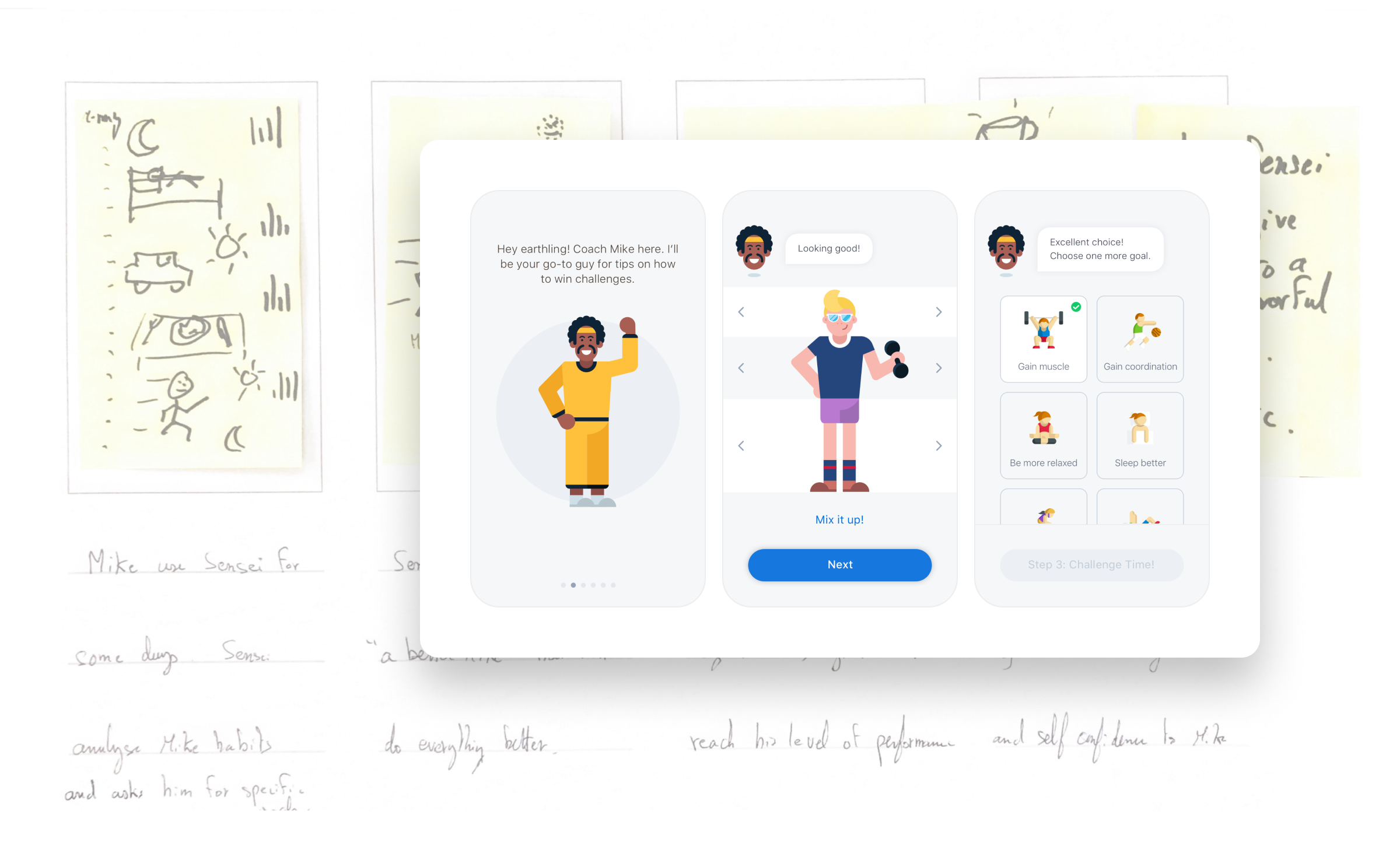
Bayer wanted to reach millennials with a gamified fitness coach called Welly. Think personal trainer meets video game, with a pharmaceutical company's values quietly baked in. I designed the look and feel to make that balancing act work.
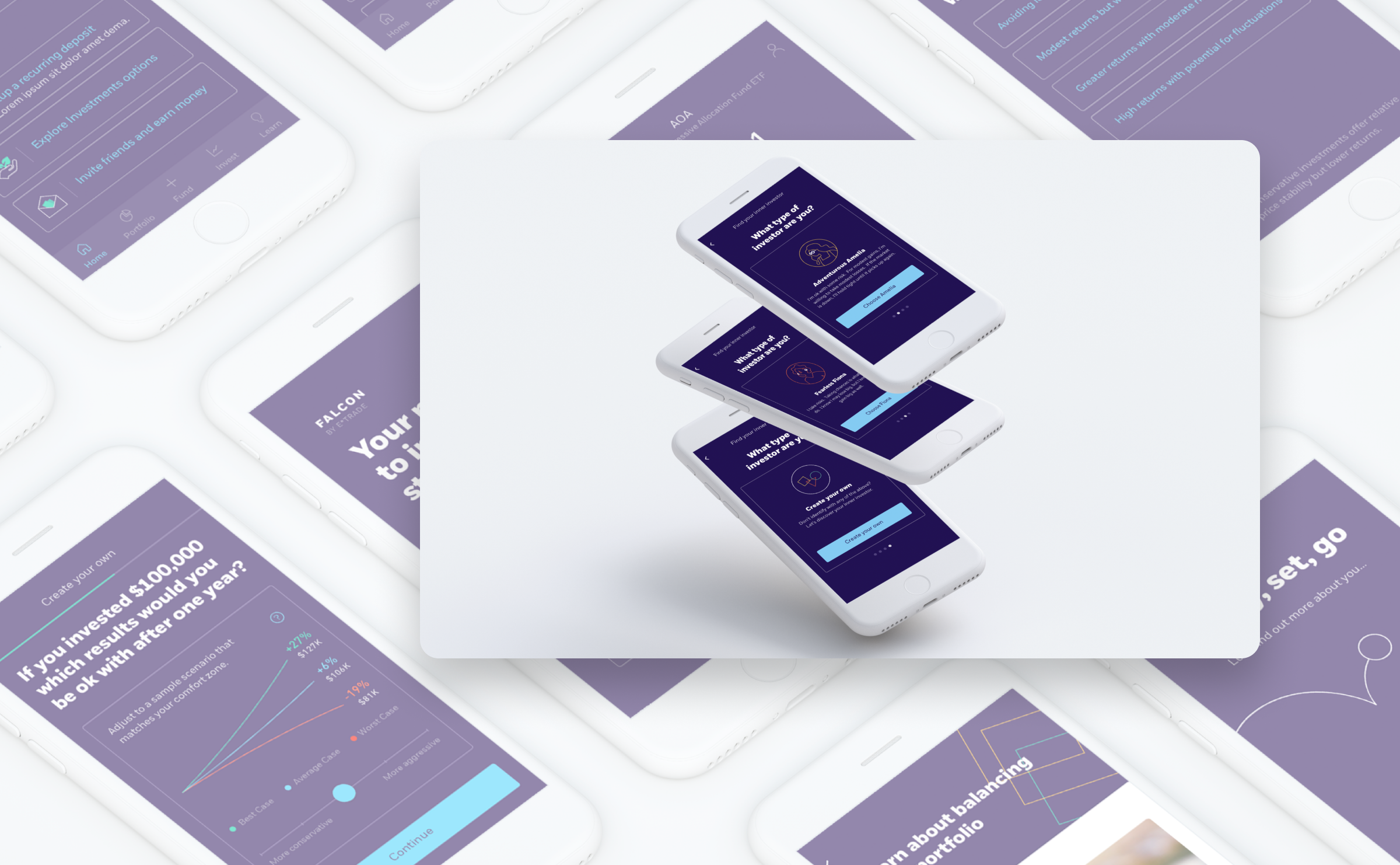
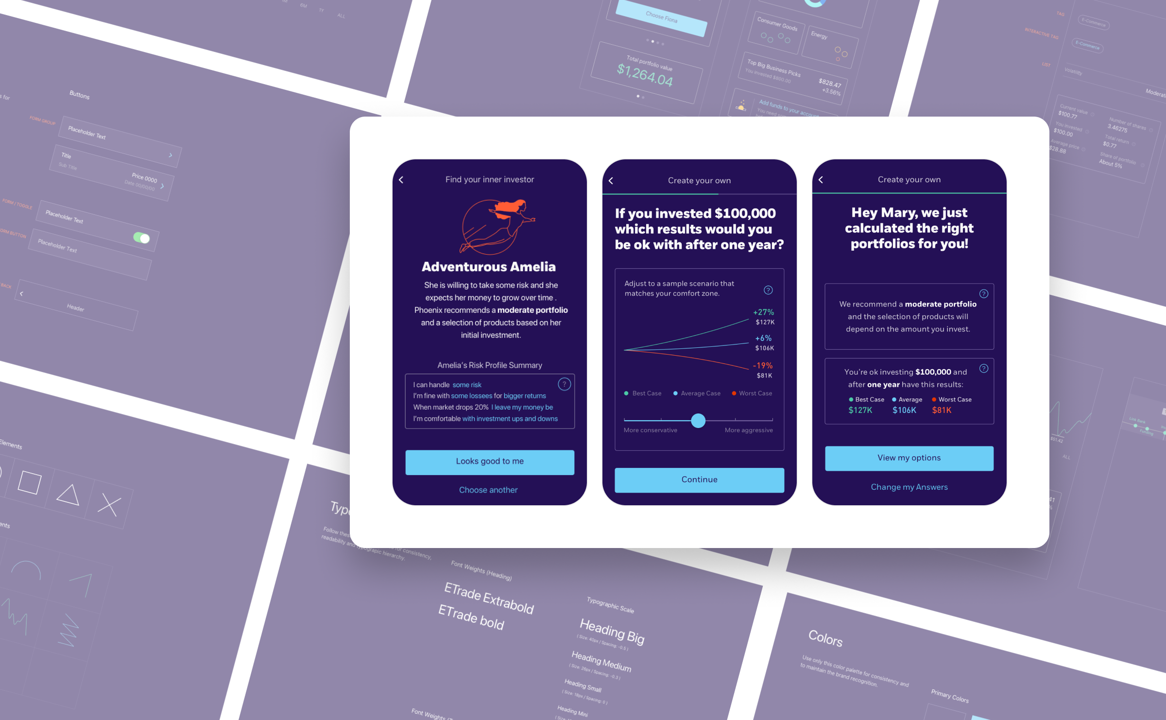
E-Trade was watching fintech startups steal their lunch and decided to fight back. I helped design a modern, approachable visual identity aimed at people who find investing confusing, making it feel less intimidating without losing the trust a financial firm needs.
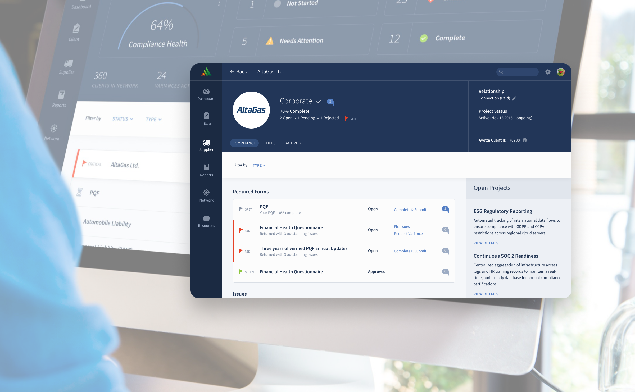
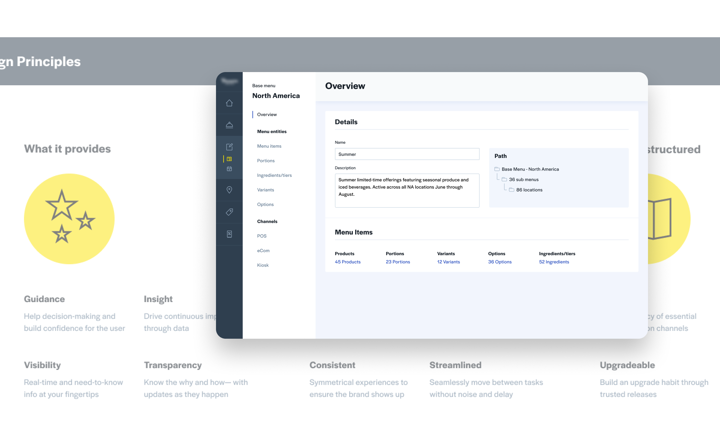
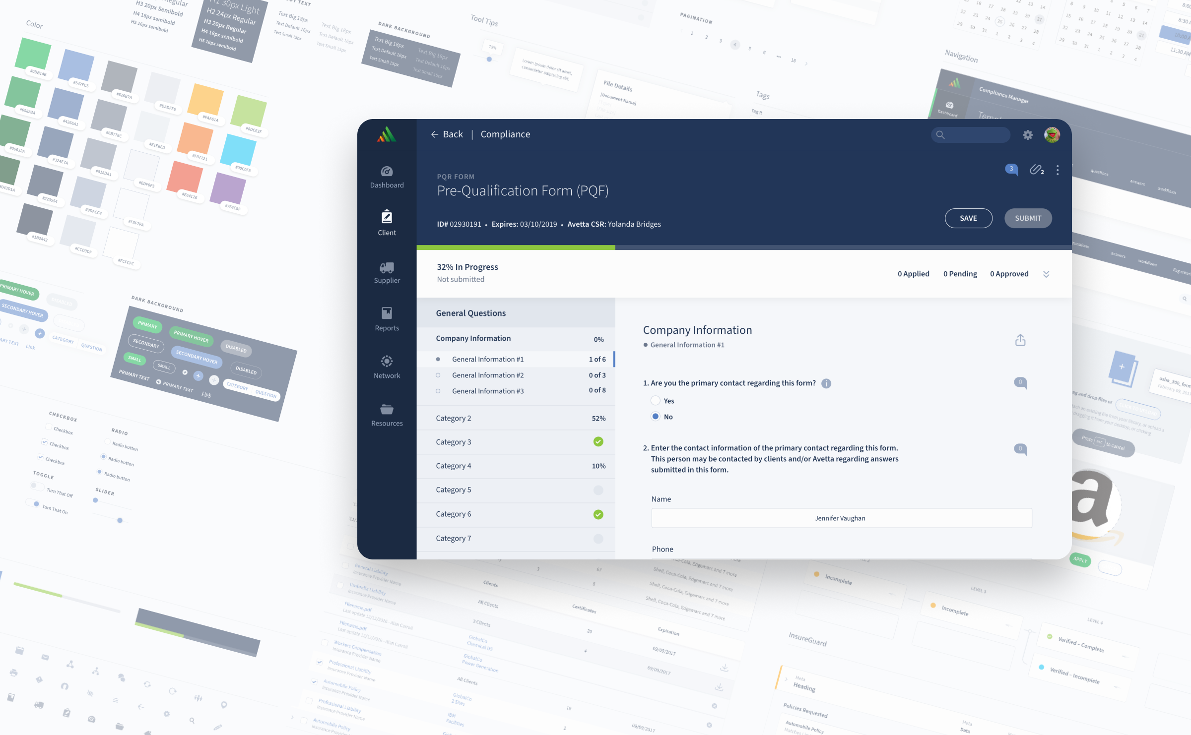
Avetta manages contractor risk at a global scale, which sounds dry until you realize that means millions of people's safety depends on it working well. After their rebrand, I helped to redesign the platform from fractured legacy experience to coherent, award-winning modern software.
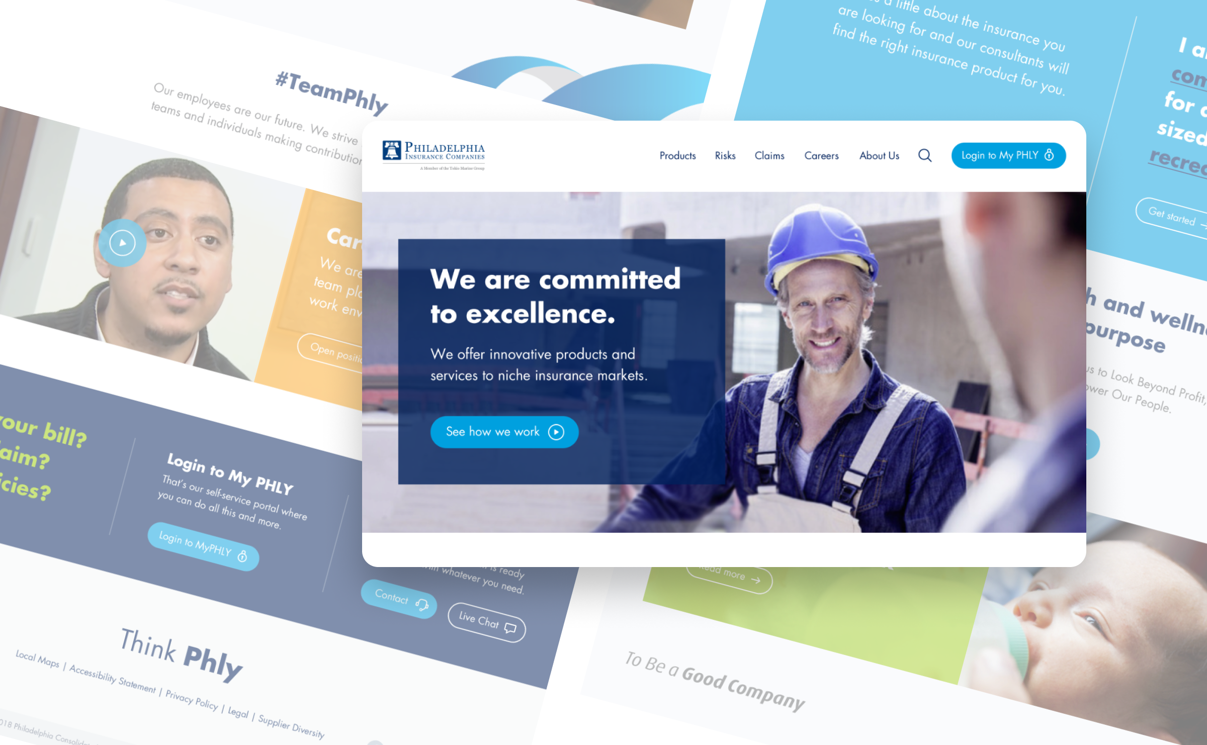
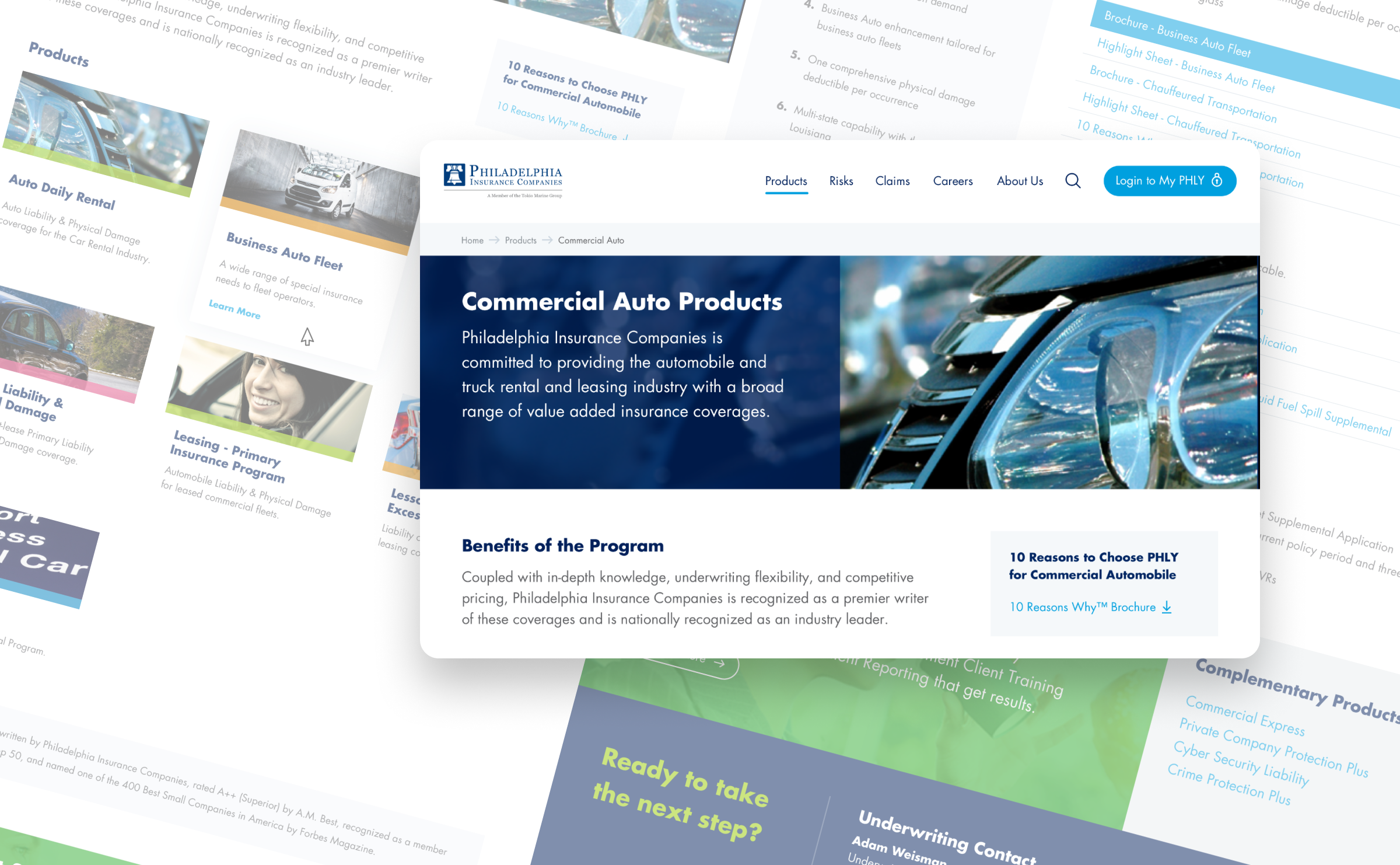
PHLY Insurance was getting a bold new look and needed their digital presence to catch up. I translated the rebrand into a UI and design system that actually felt like the same company, not a visual identity crisis in the making.
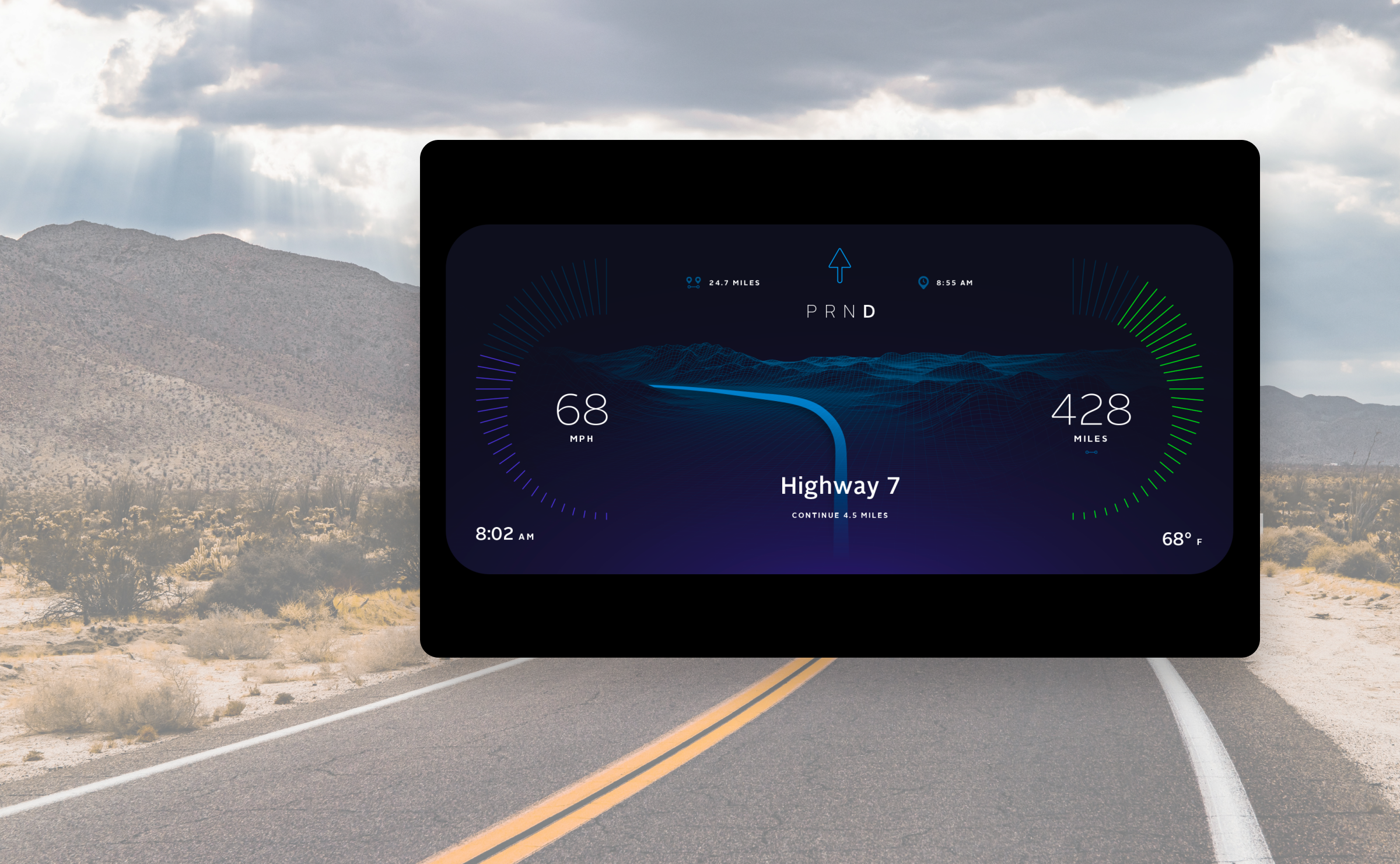
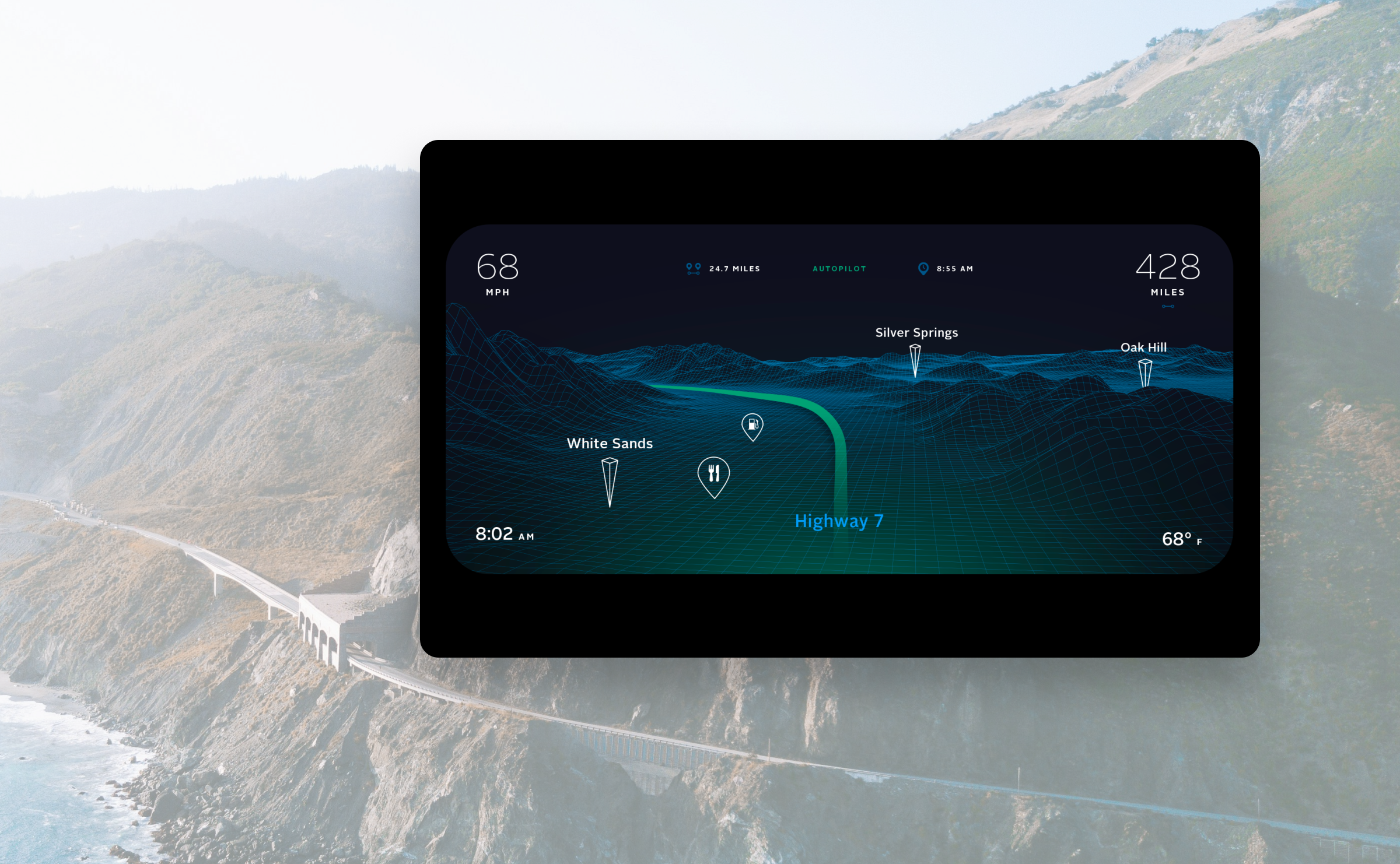
Speculative design for a futuristic car dashboard. What does the driver's view look like when anything is possible?
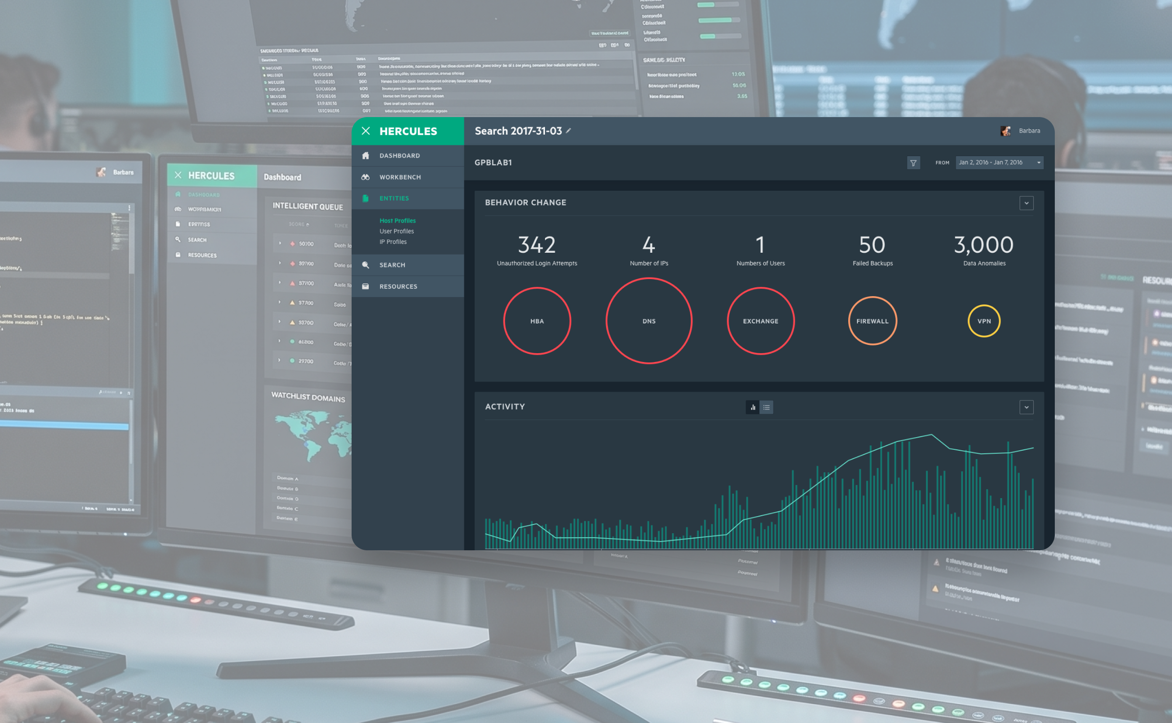
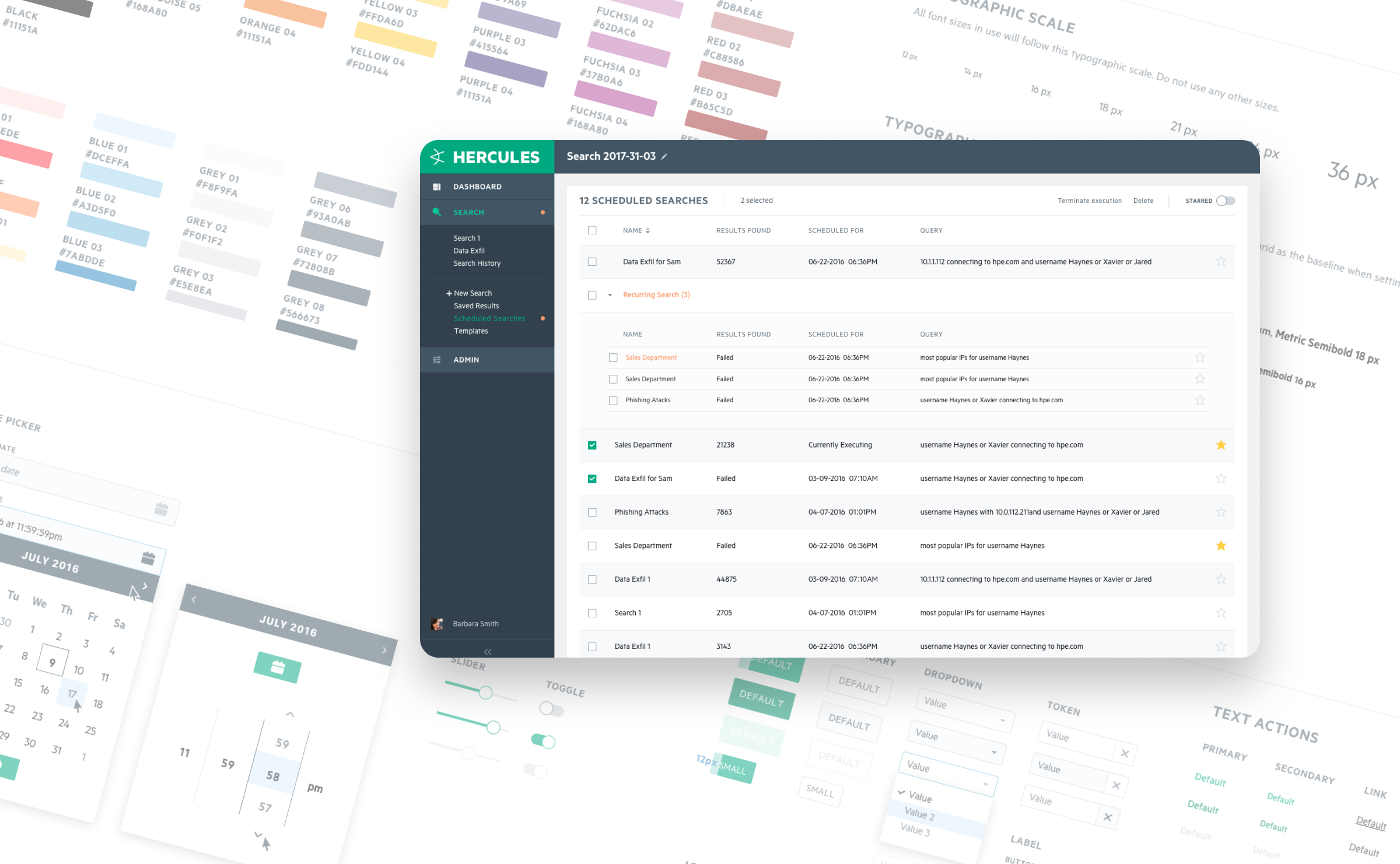
HPE had several security and compliance tools that had long been living separate, incompatible lives. I helped bring them together into ArcSight: one platform with a coherent visual language, a solid design system, and an award to show for it.
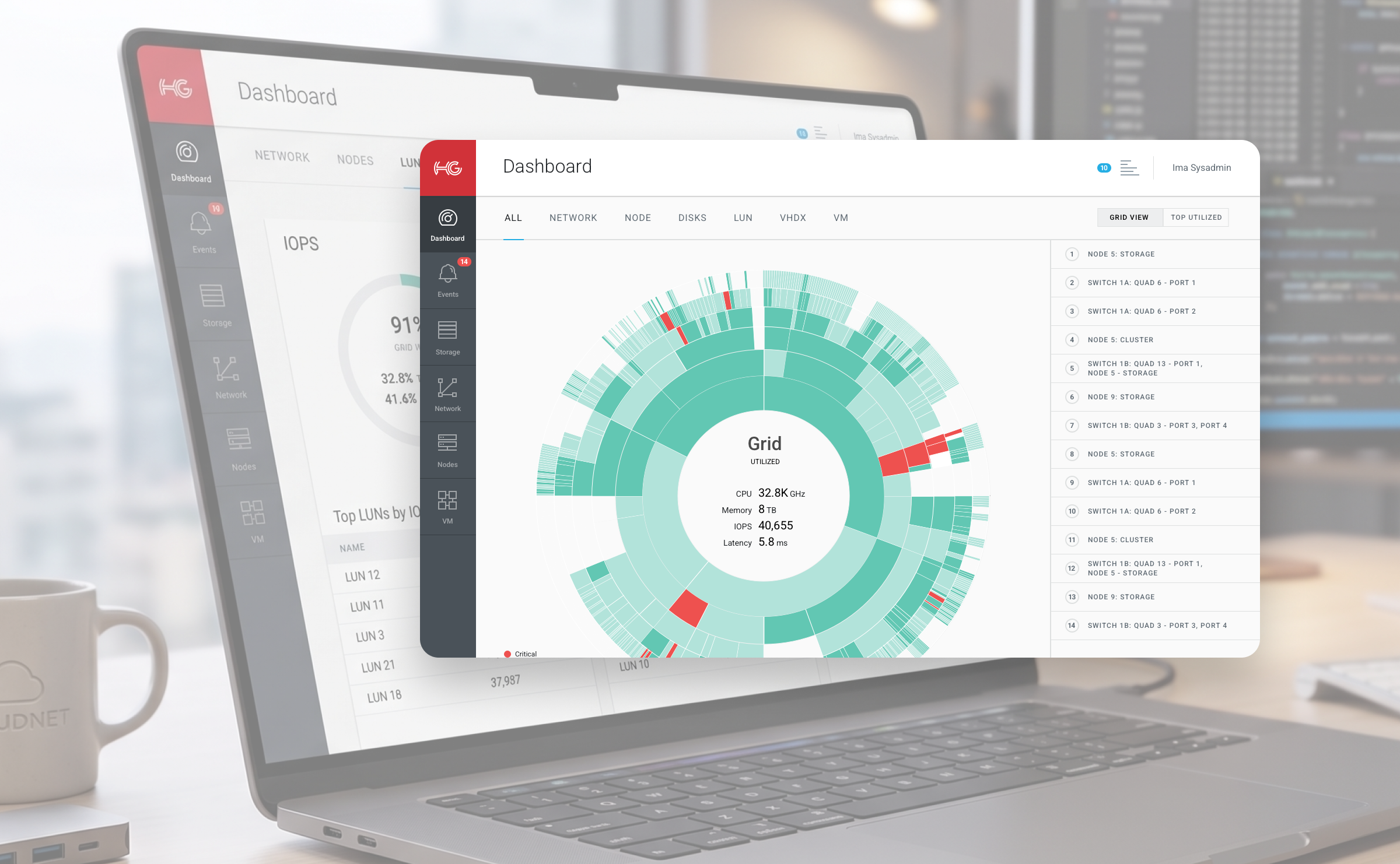
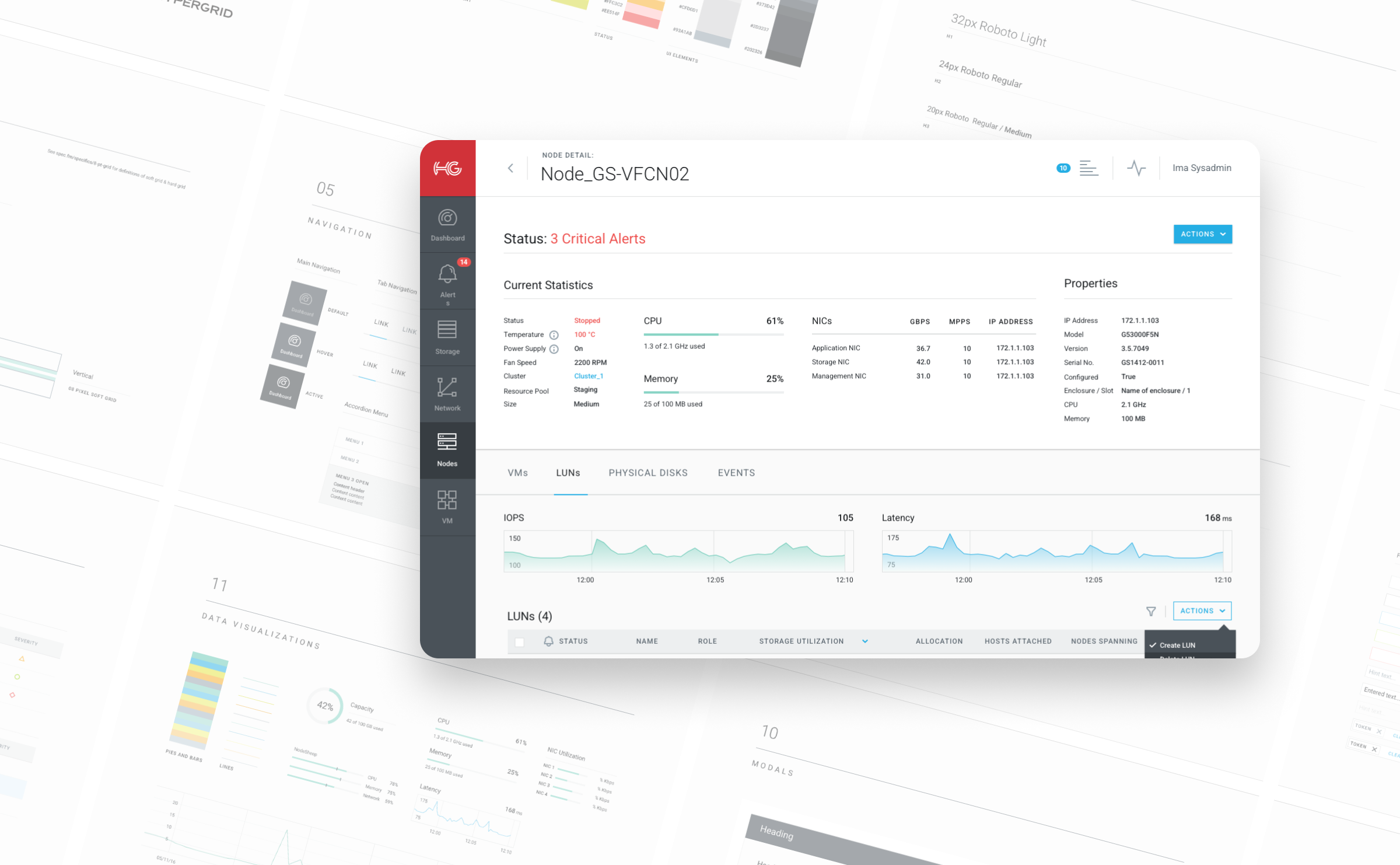
We built HyperGrid's cloud management platform from nothing. I led the visual identity and UI, and we ended up with something that not only worked well but helped to secure investor funding and, eventually, sell the whole company.
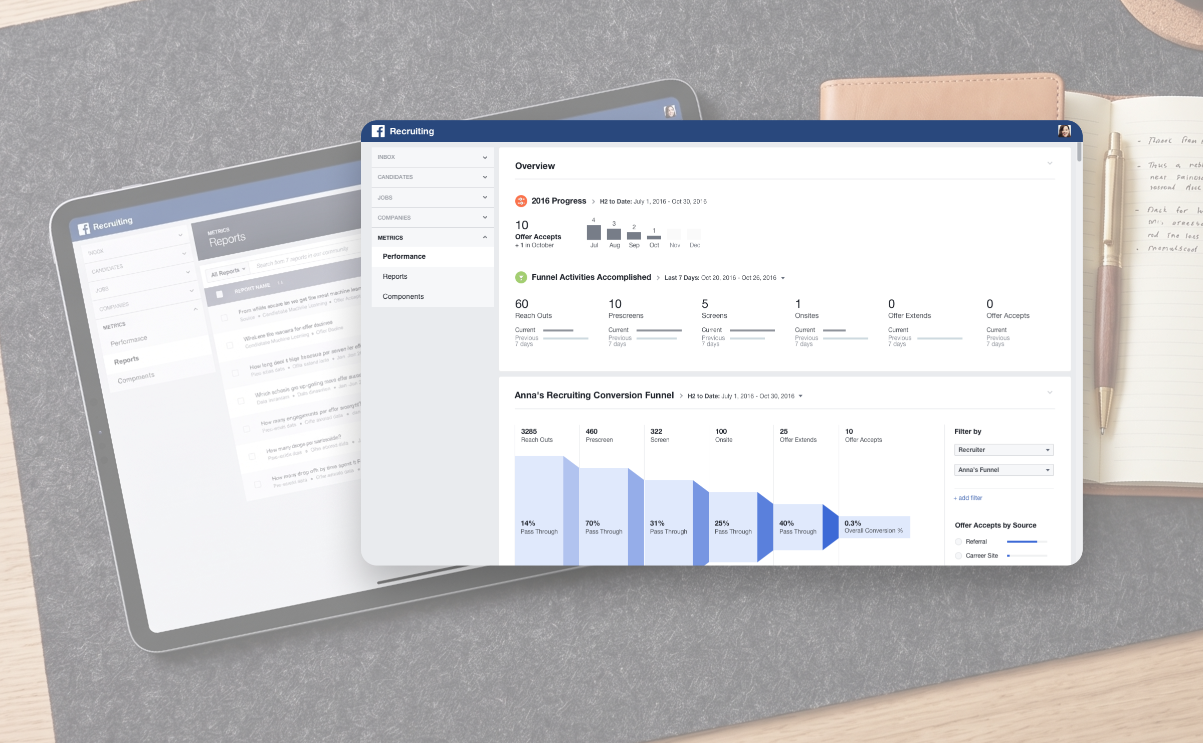
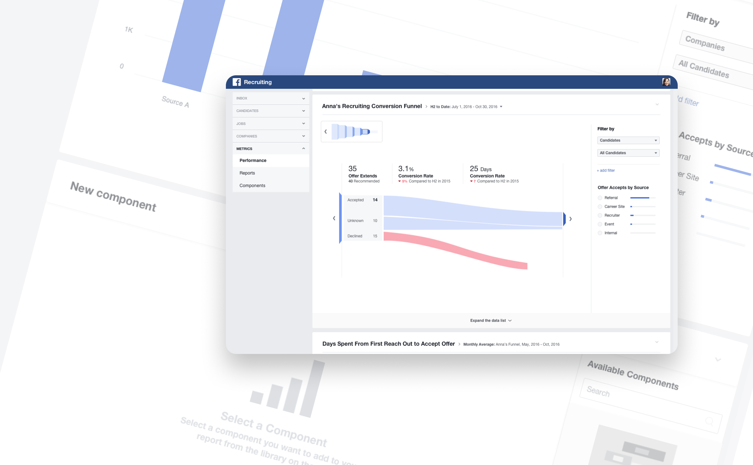
Meta's internal recruiters were drowning in data but starved of insight. After a quick round of interviews to understand the actual problems, I helped turn the findings into concrete design artifacts, the kind that get used to build things rather than filed away forever.
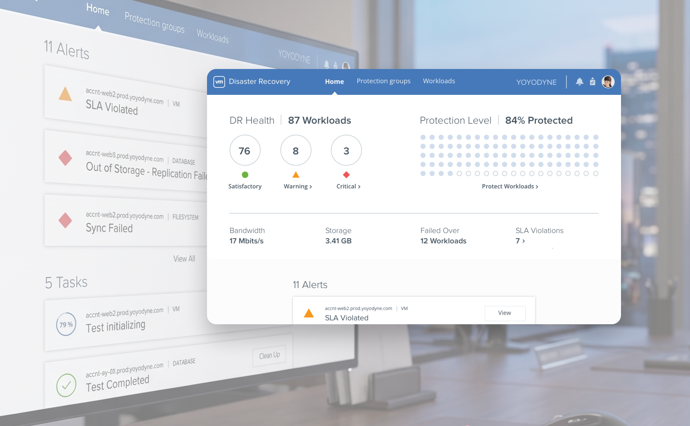
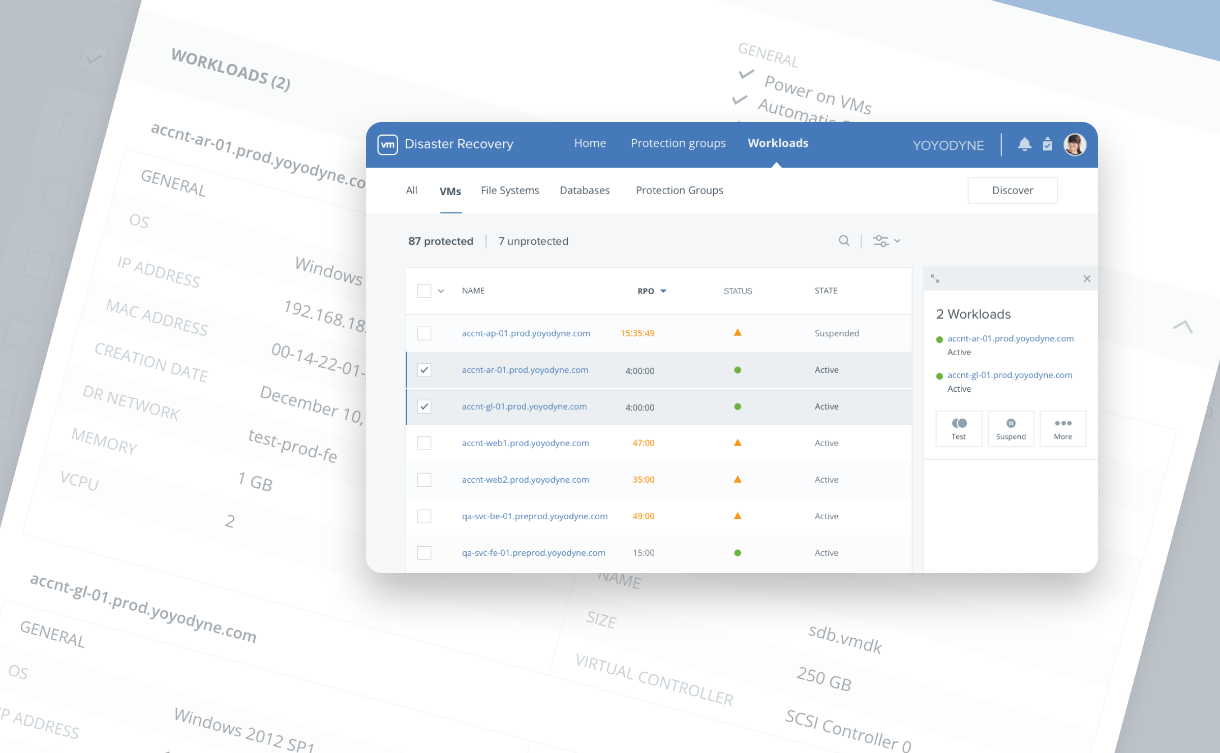
Nobody wants to be using a disaster recovery tool. It means something has already gone wrong, and VMware's legacy version made a bad situation worse. The redesign turned a dense, confusing interface into a dashboard you can actually read under pressure.
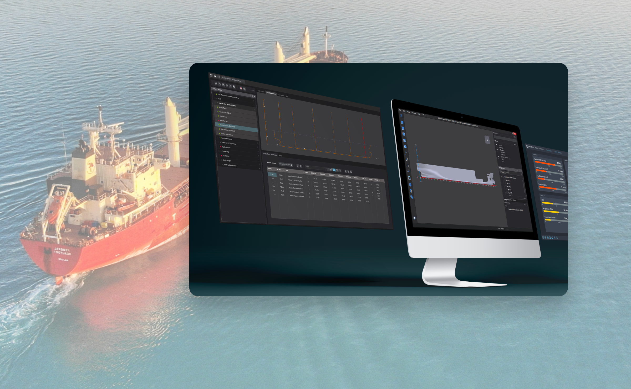
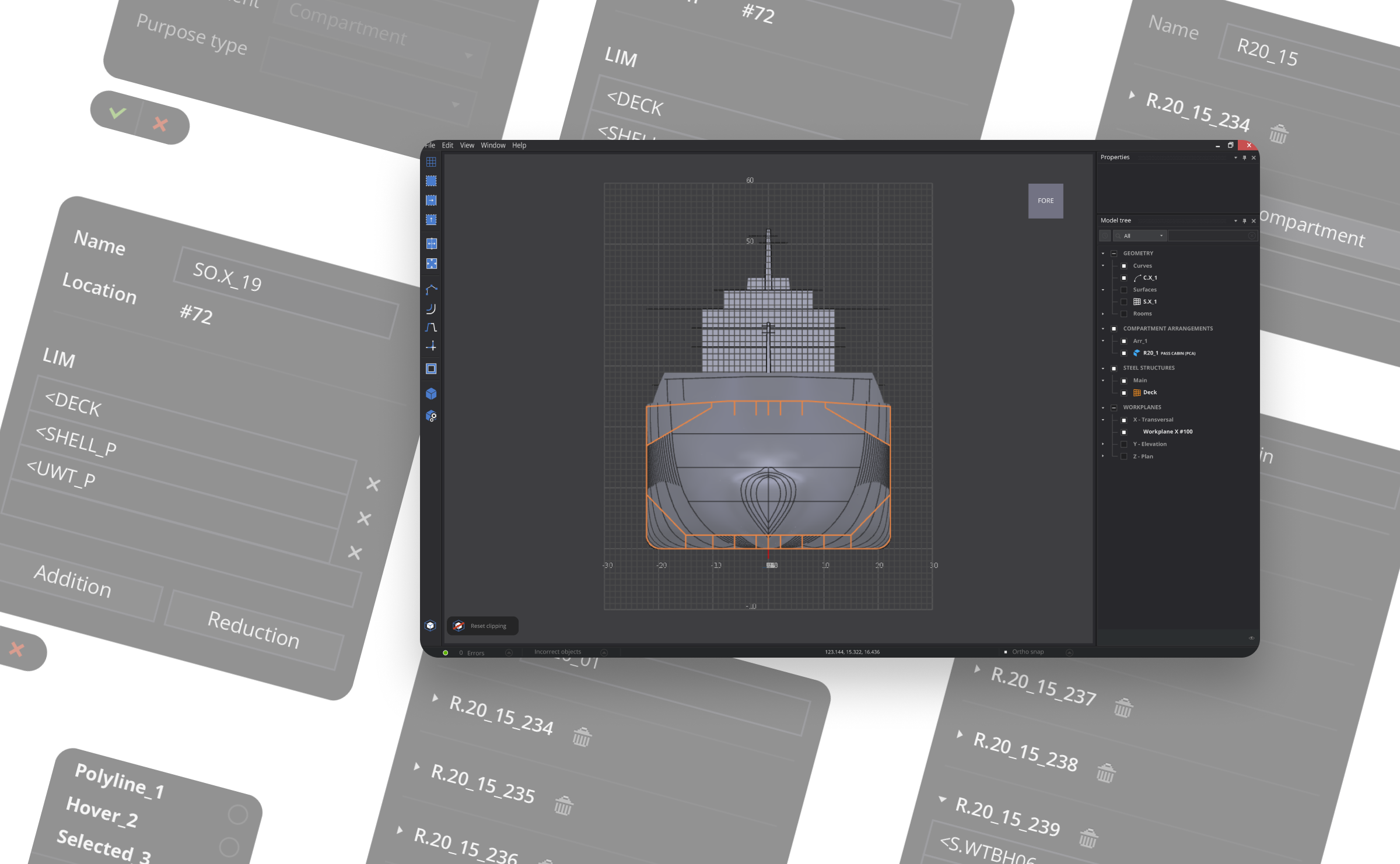
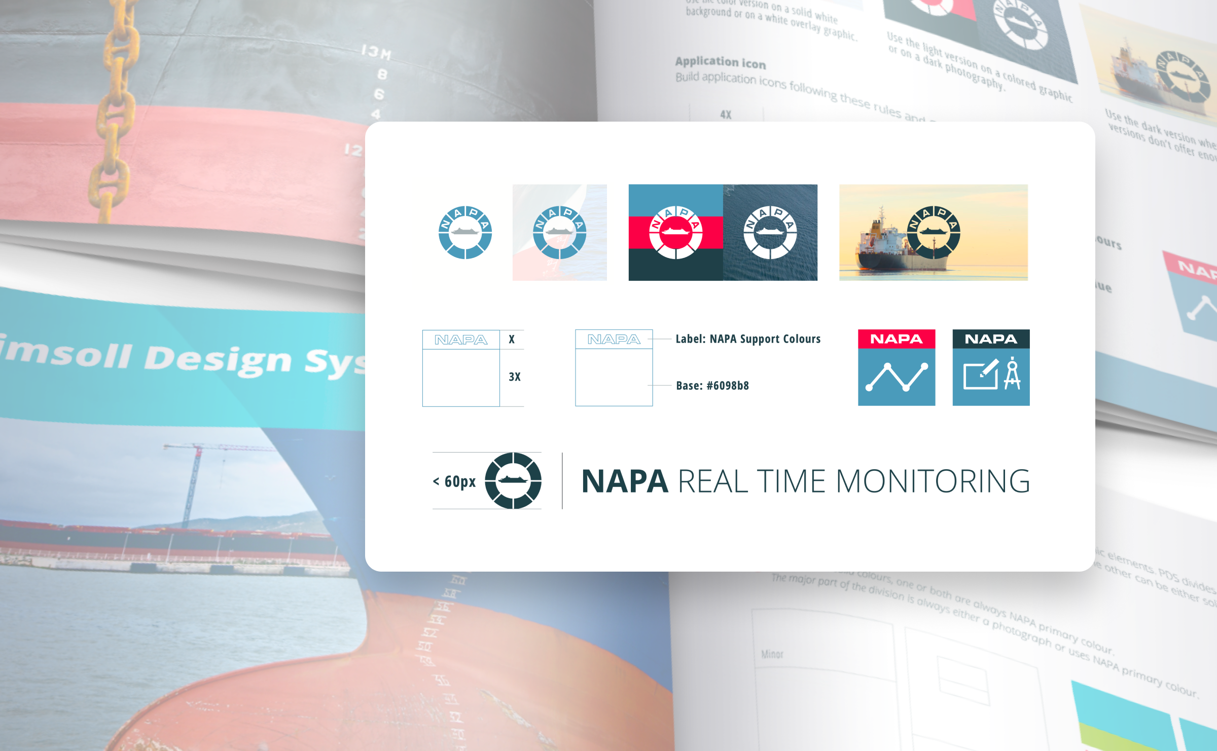
NAPA builds software for designing ships, a niche that made it all the more interesting. I worked with the development team on the application UI.
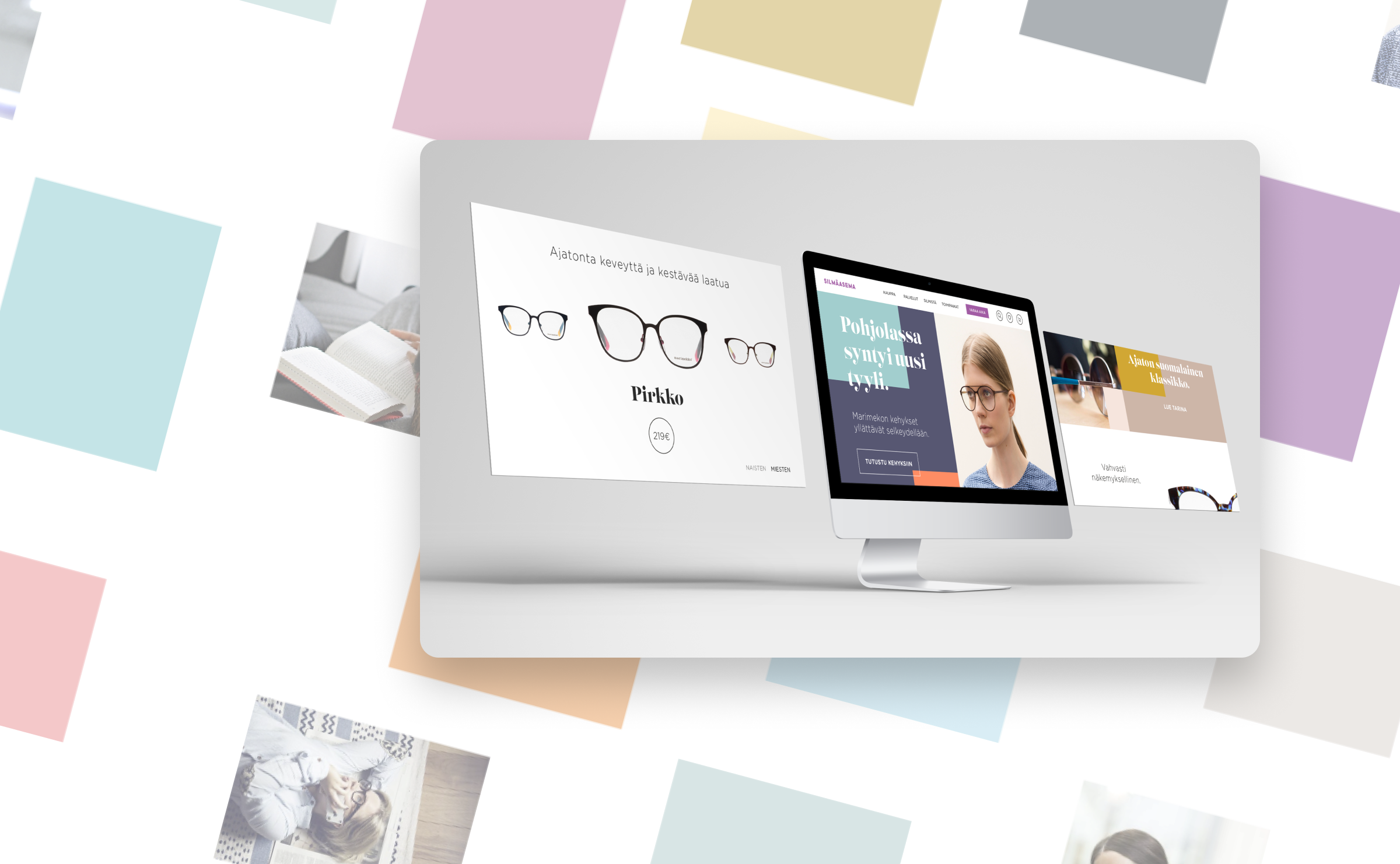
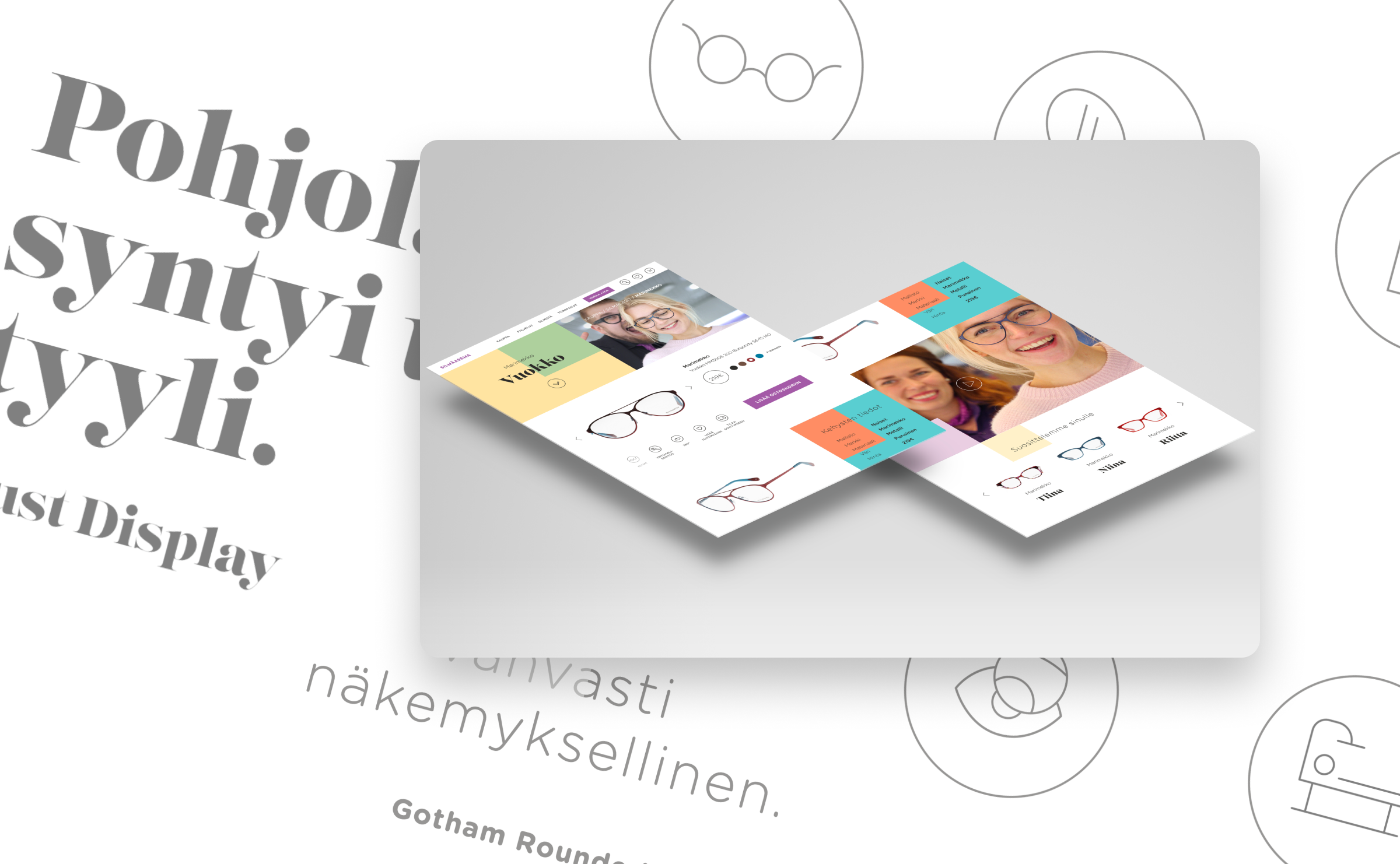
A concept to help national eyewear chain see itself a little differently.
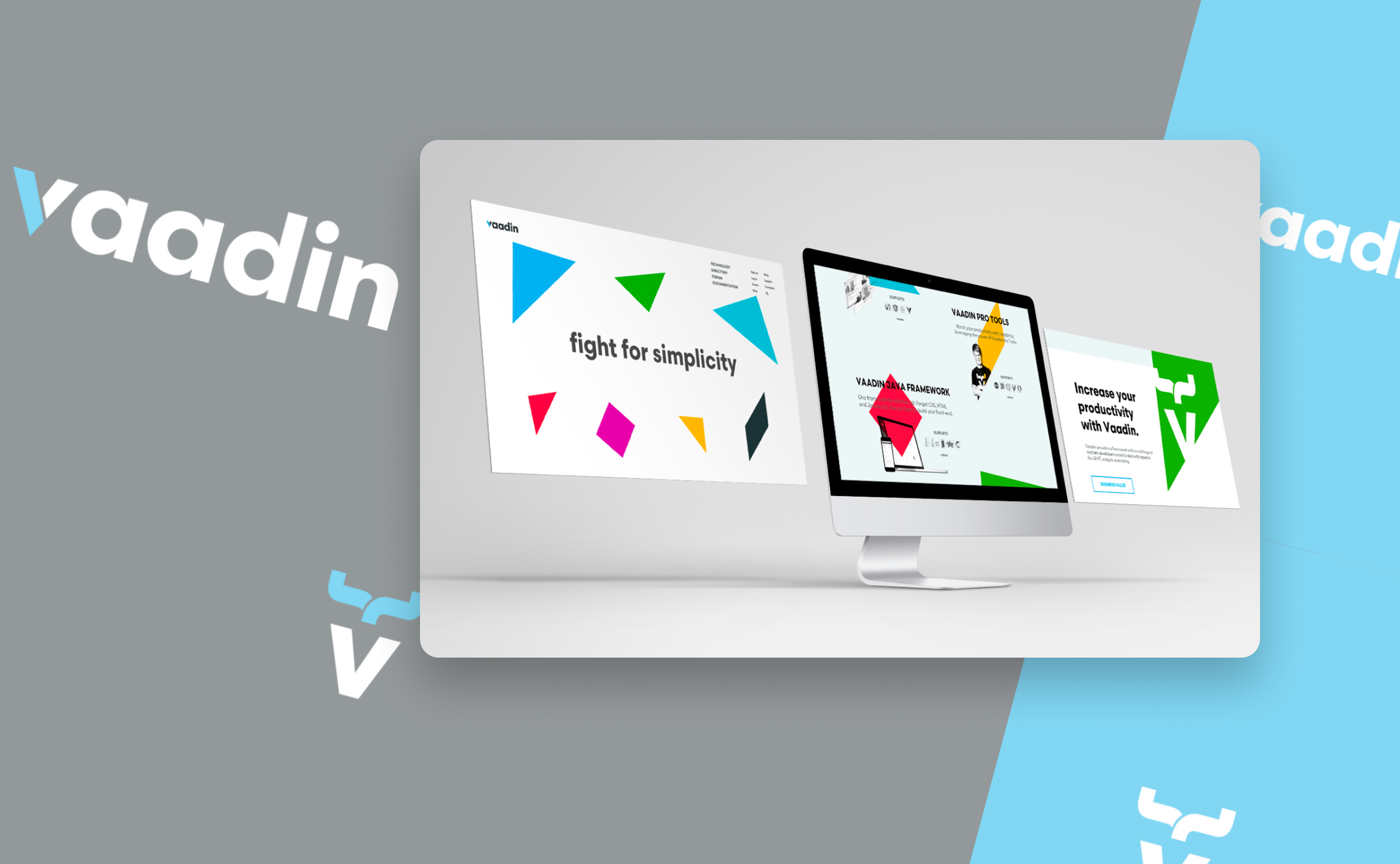
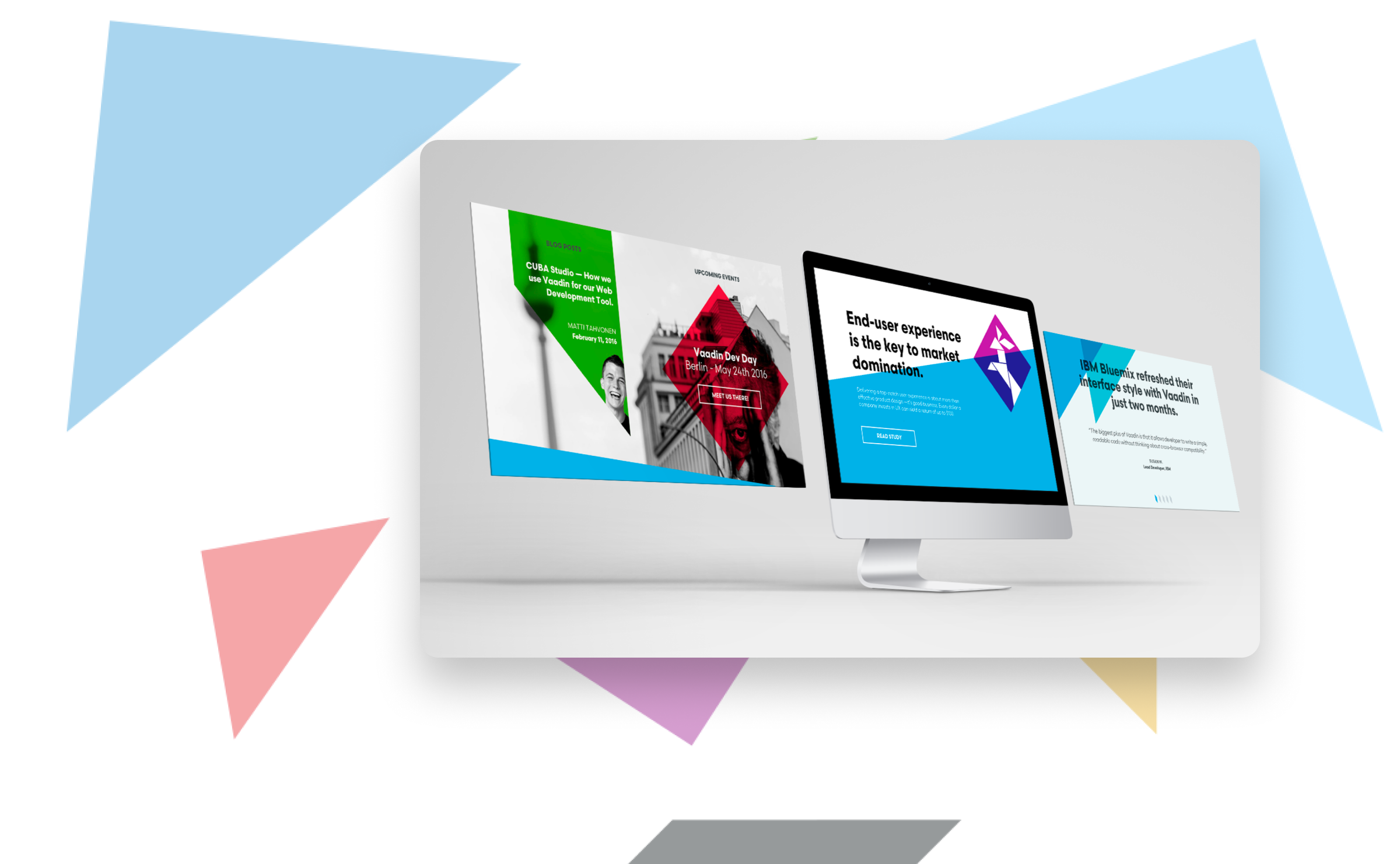
A conceptual refresh for Vaadin, giving a developer-loved product a look that matches how good it actually is.
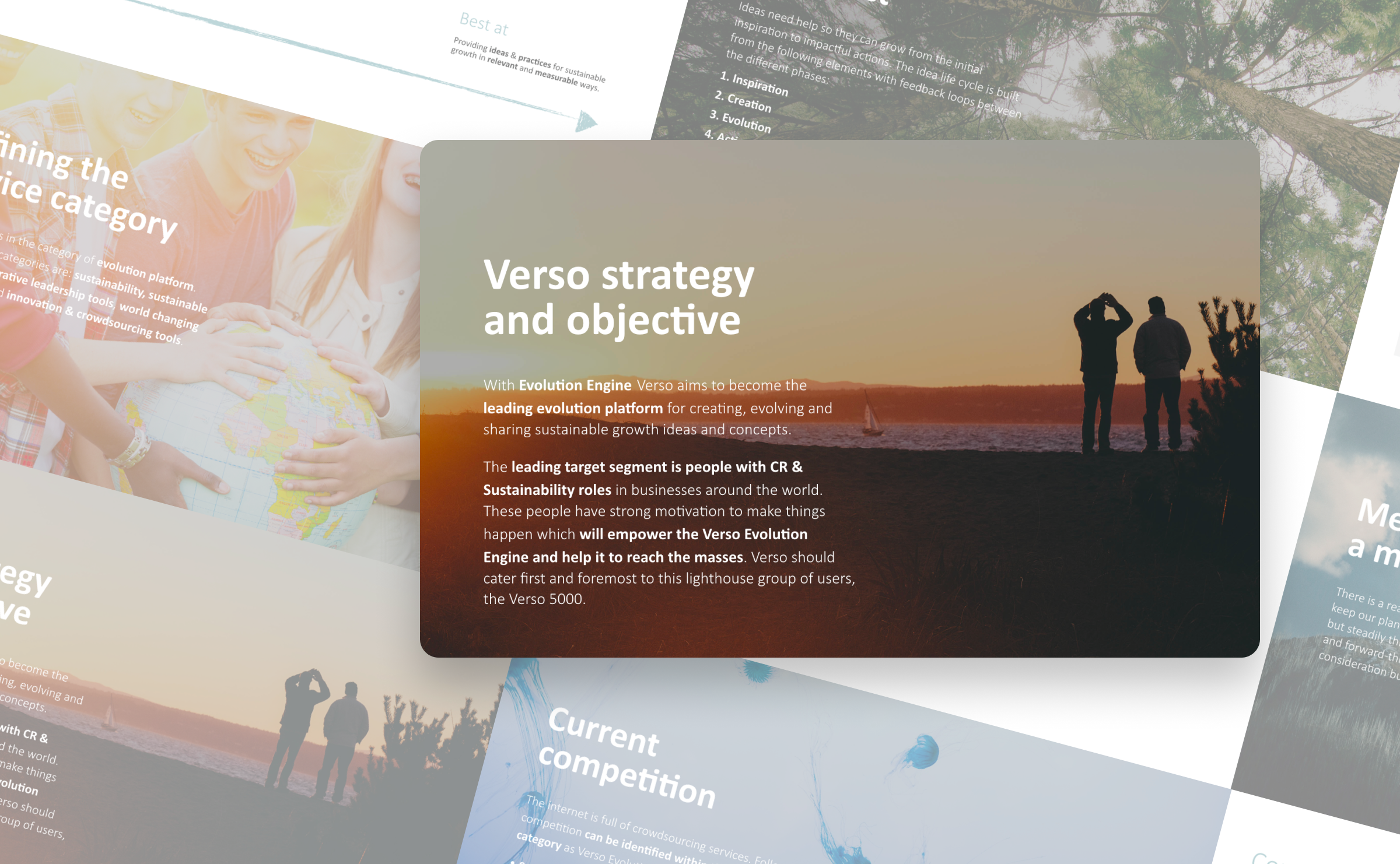
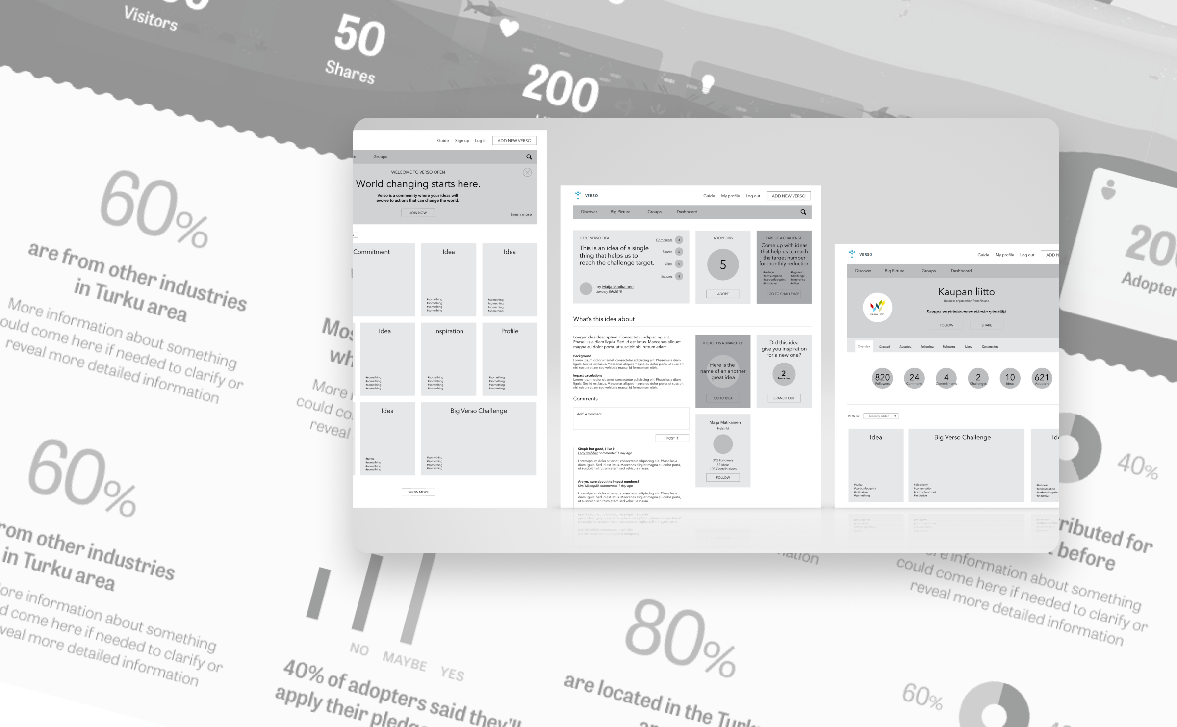
Helped a sustainability startup that wanted to crowdsource sustainability ideas. I mapped how users would move through the platform and designed a gamified loop to keep the good ideas growing.
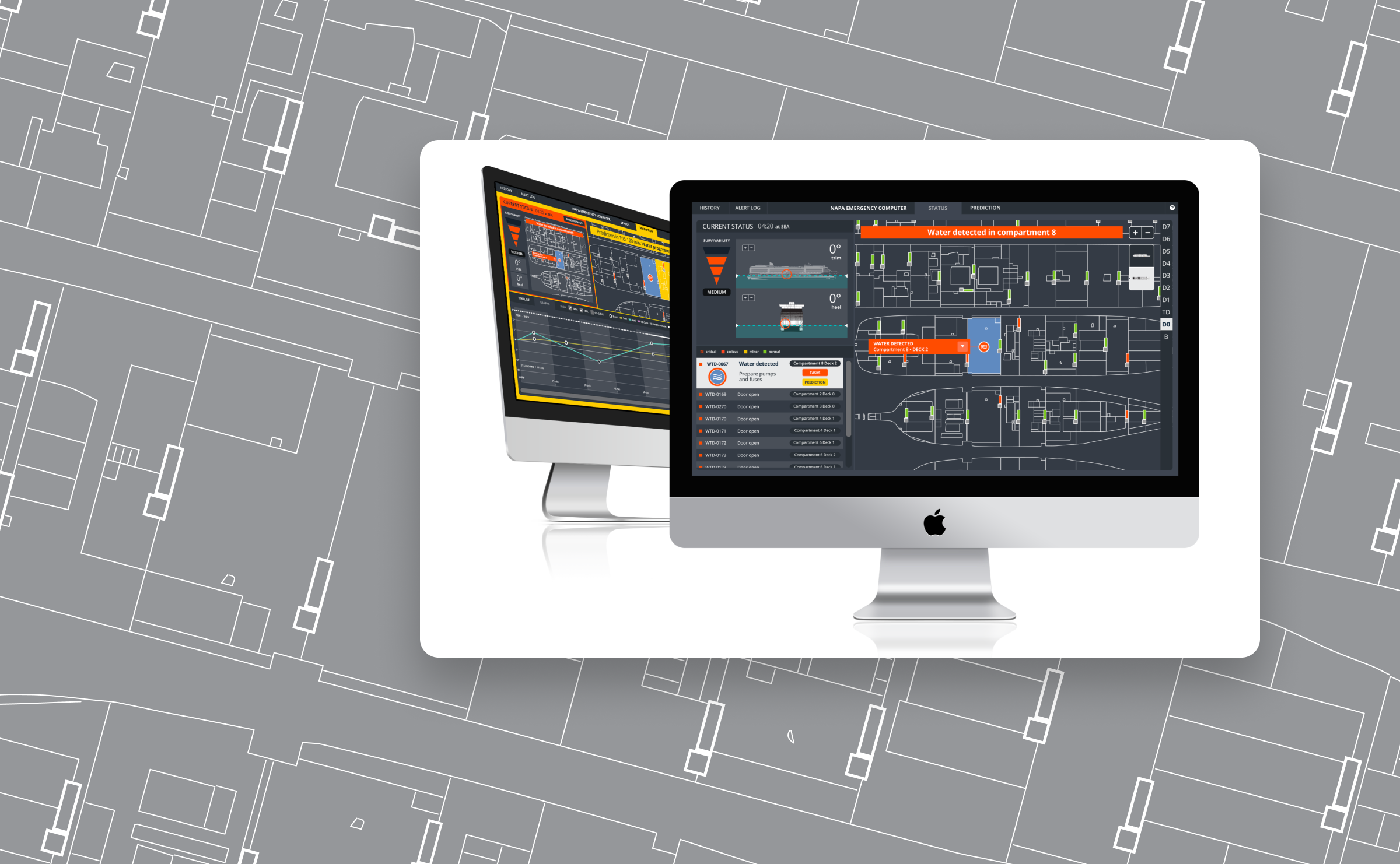
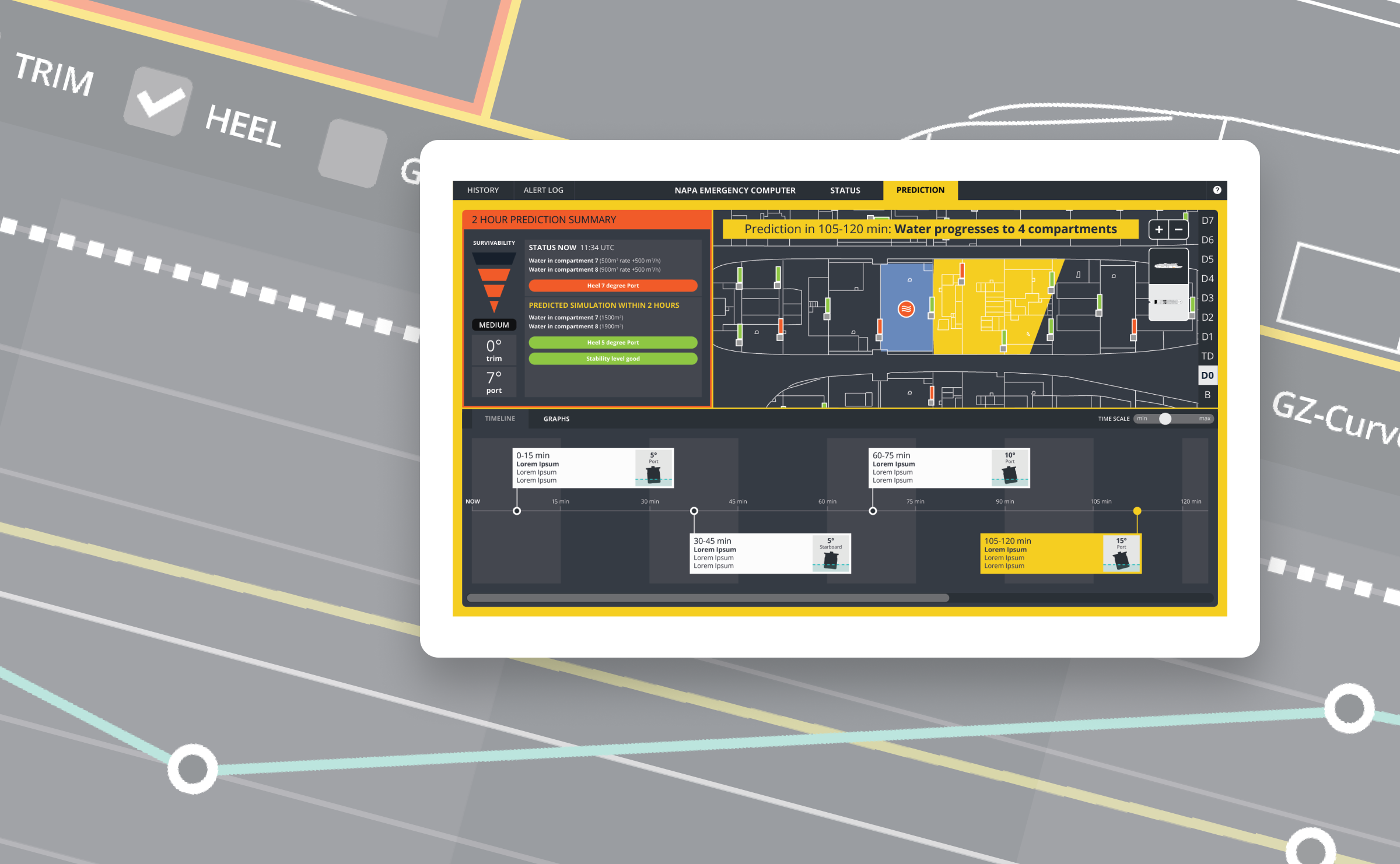
If a ship is taking on water, the last thing the crew needs is confusing software. I redesigned NAPA's emergency safety tool to be clear, fast, and built for the moments when everything else has already gone wrong.
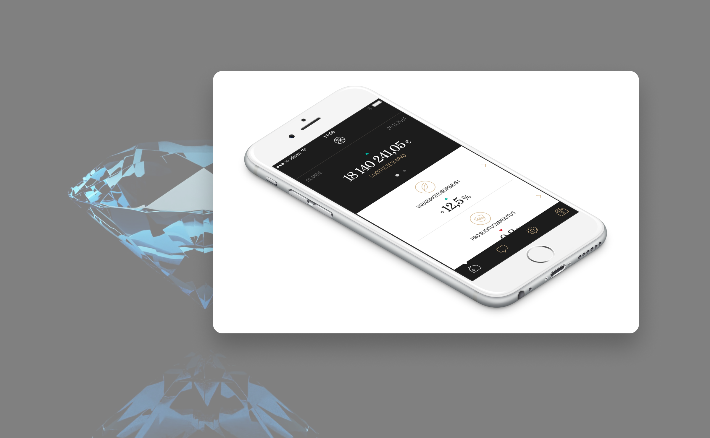
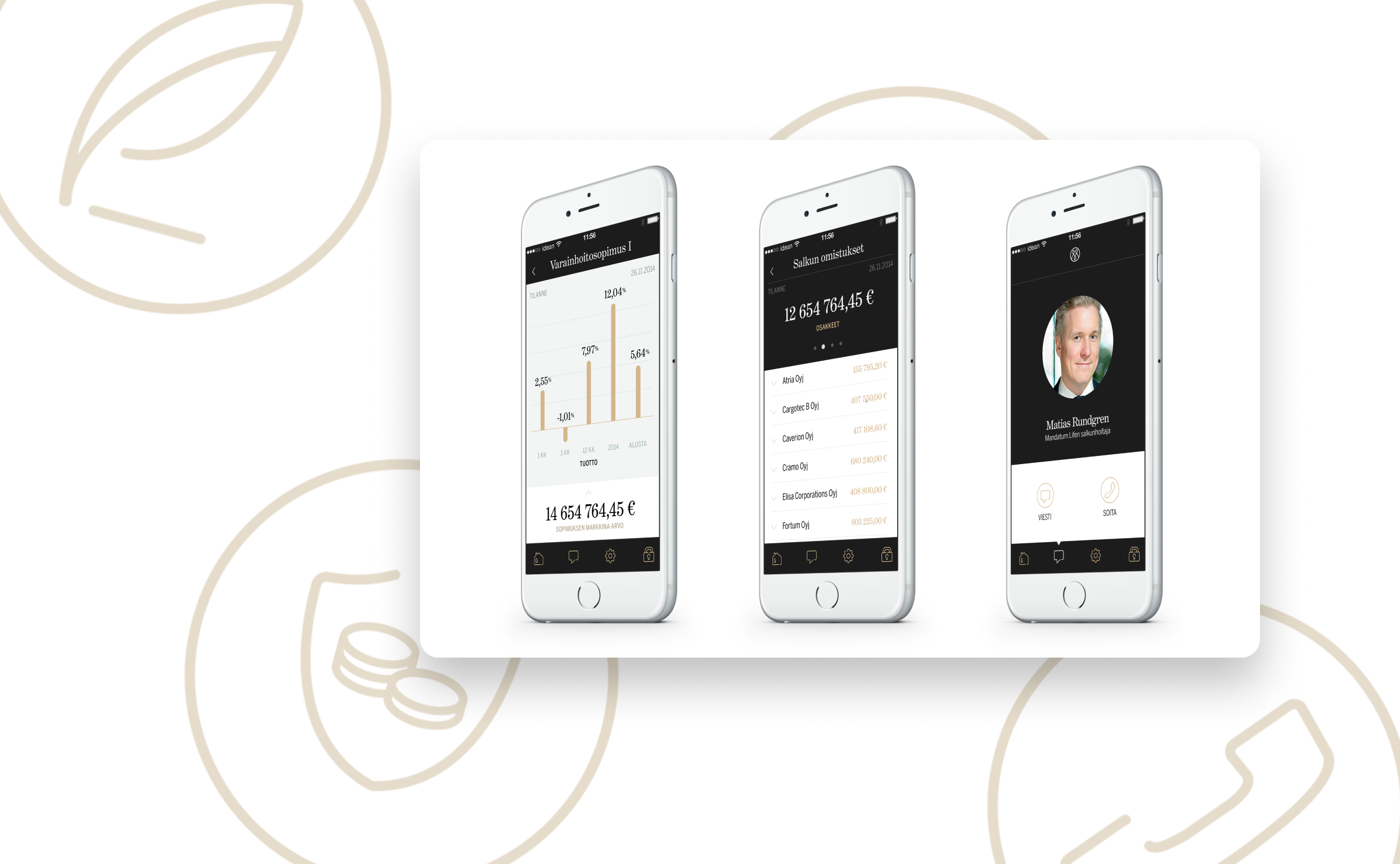
Helped to design a new mobile experience for investor bank that felt as premium as the bank itself, without sacrificing clarity for the sake of looking fancy.
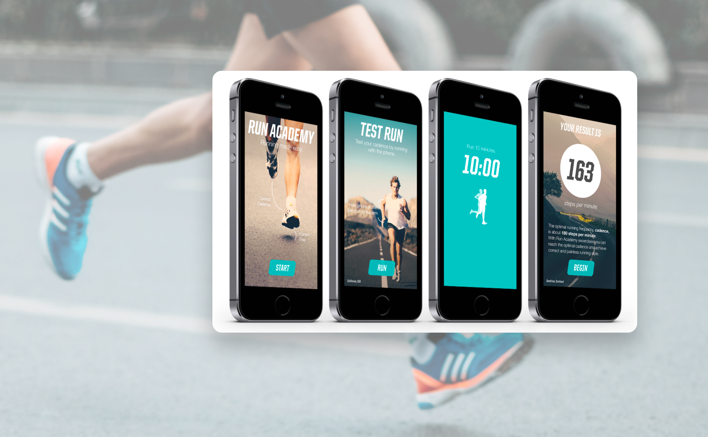
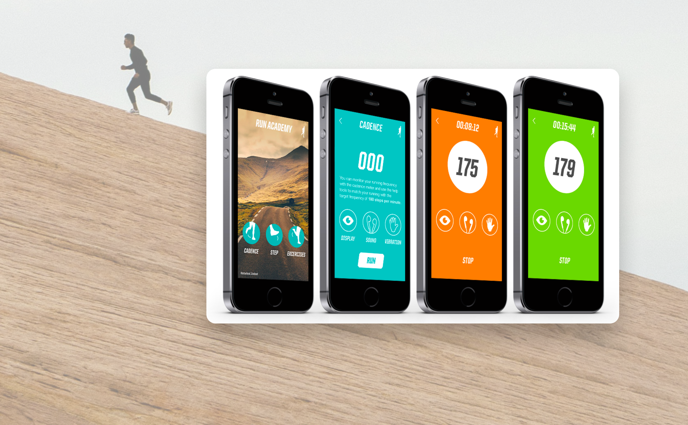
A startup that put motion sensors inside running shoe soles to analyze your gait, which sounds like sci-fi but was very real. I designed the product identity and mobile app to make all that data genuinely useful.
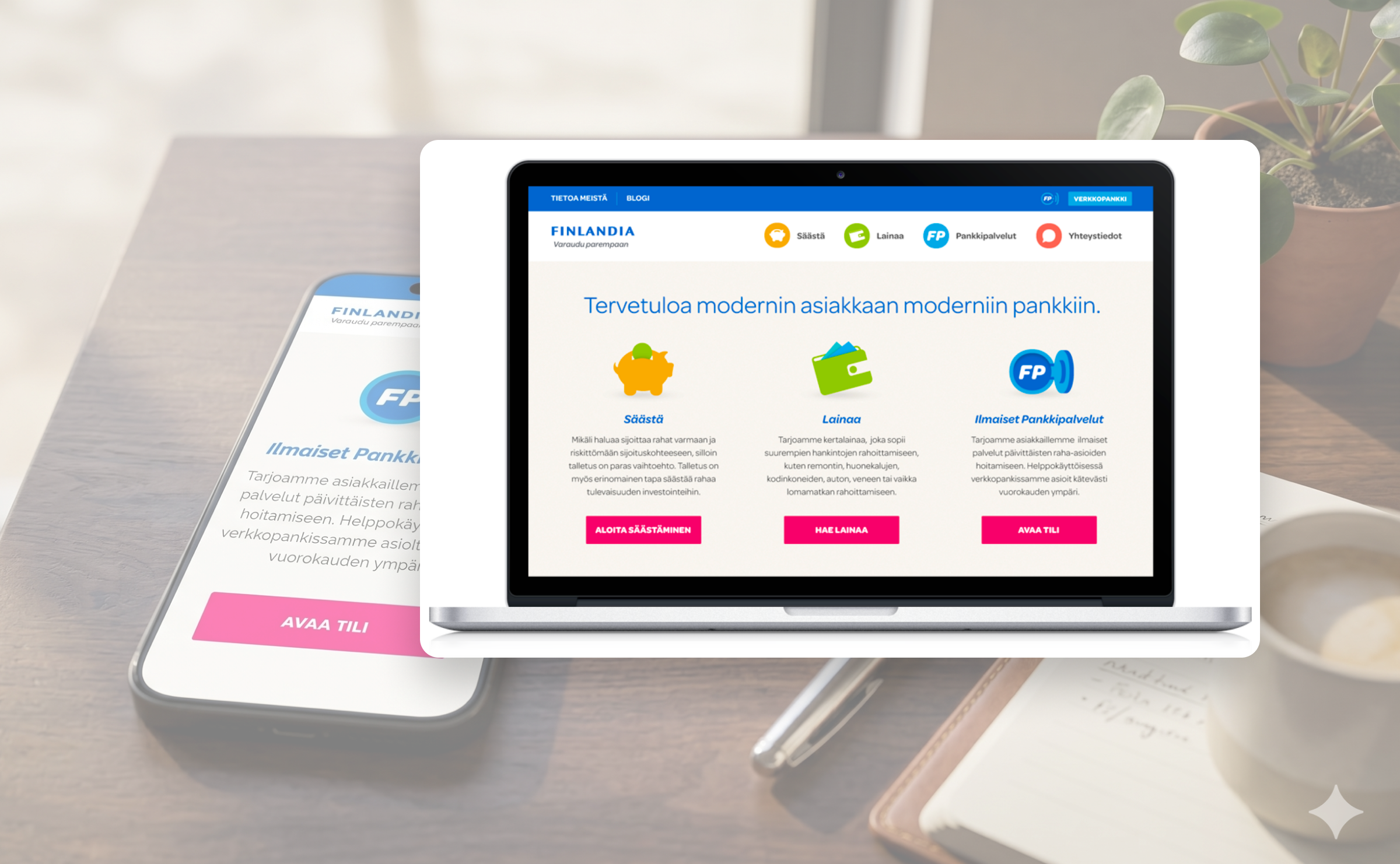
A new Finnish online bank needed an identity built from scratch. I designed the visual style and website concept to attract people who were ready to ditch the incumbents.
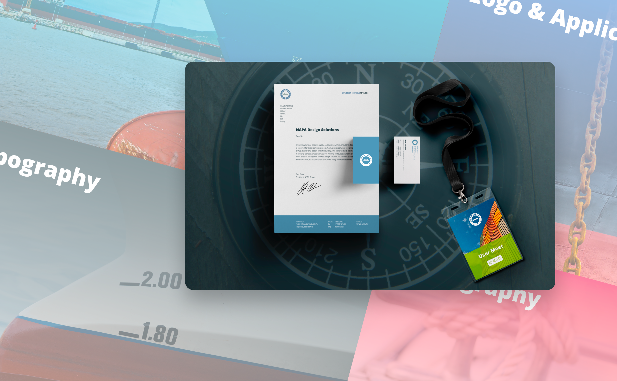
NAPA's visual identity had drifted over the years, not broken, just inconsistent. I worked with the marketing team to pull it back together: refreshed visual style, updated brand materials, one coherent look.
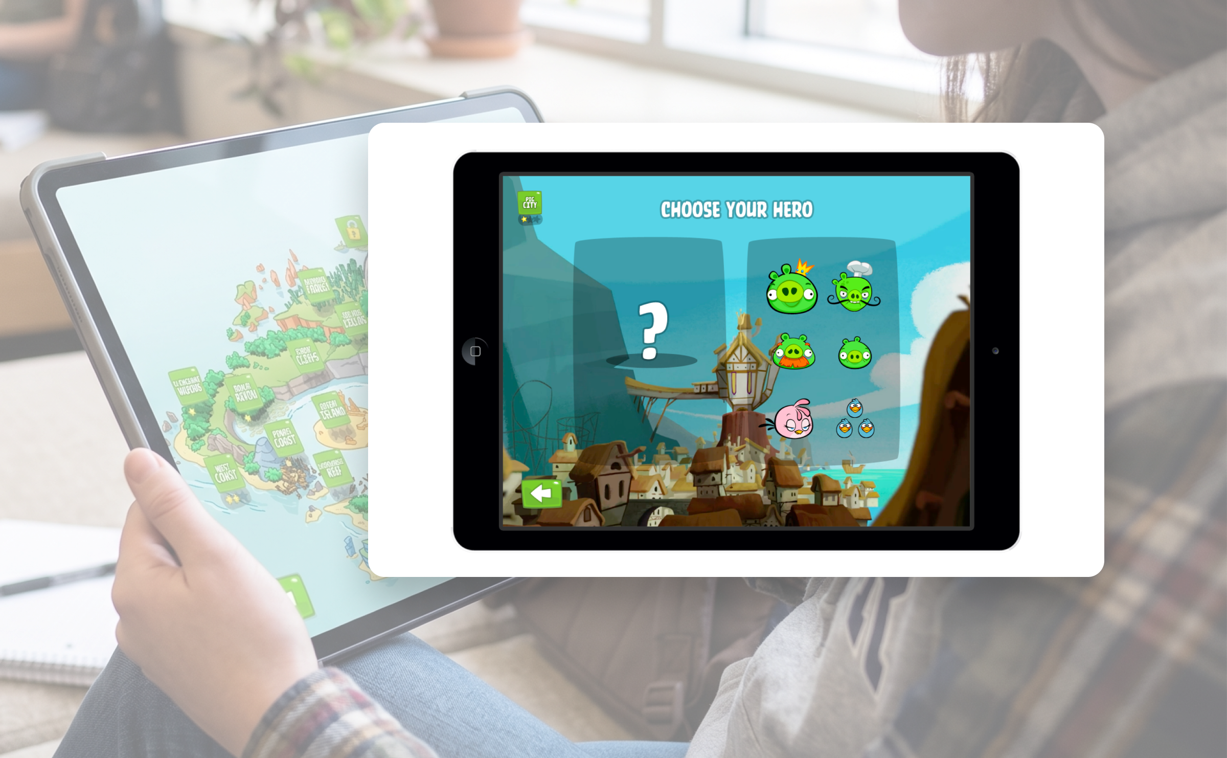
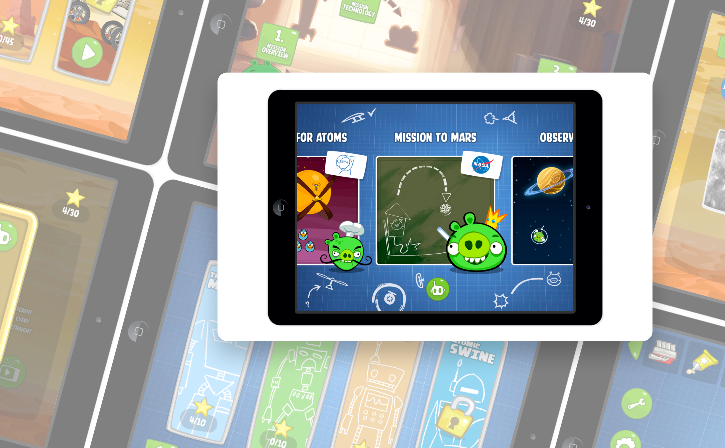
The Angry Birds people at Rovio were exploring what educational gaming could look like beyond their existing titles. Our team of two designed early concepts and visual directions for a new ecosystem they were beginning to imagine.
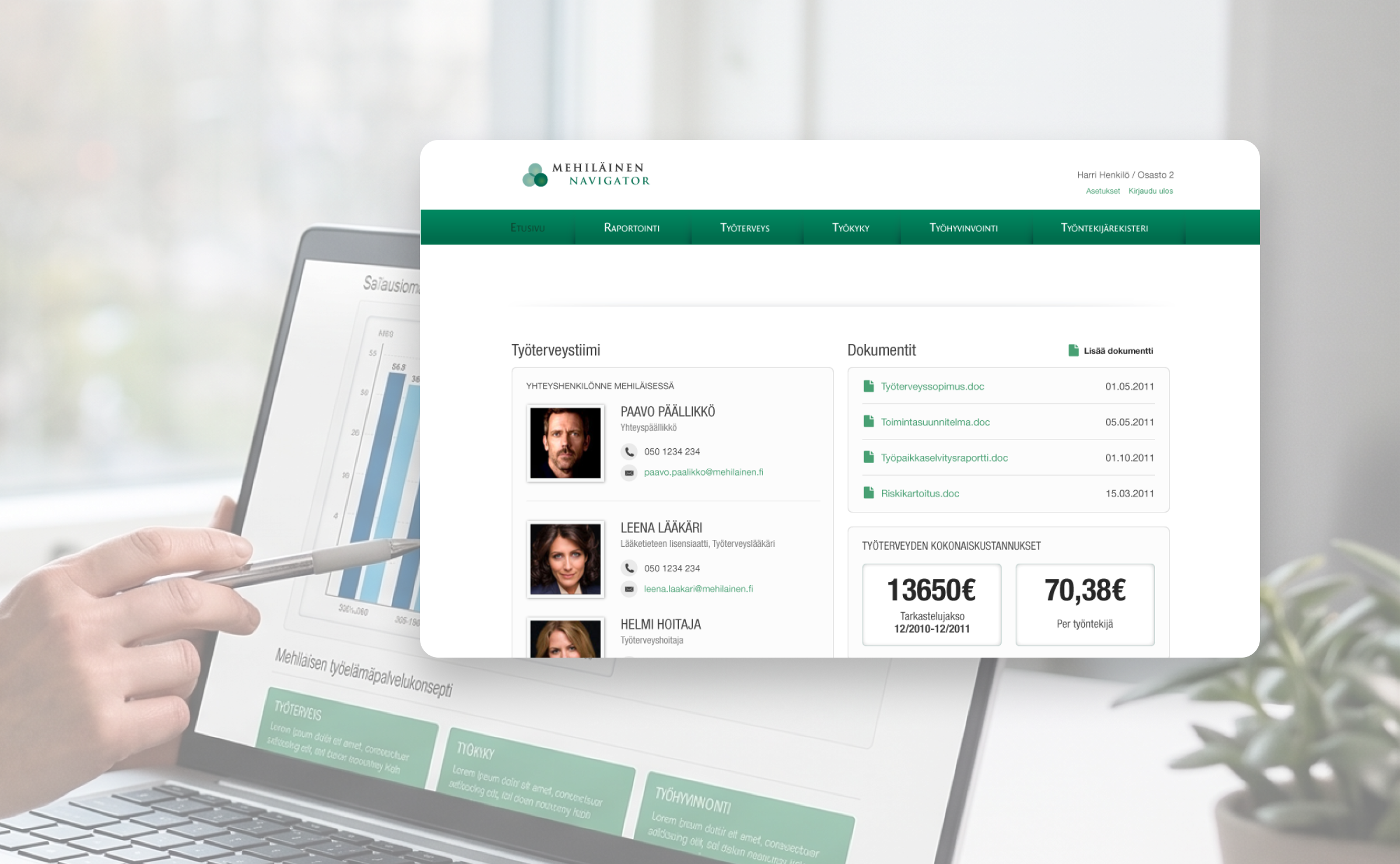
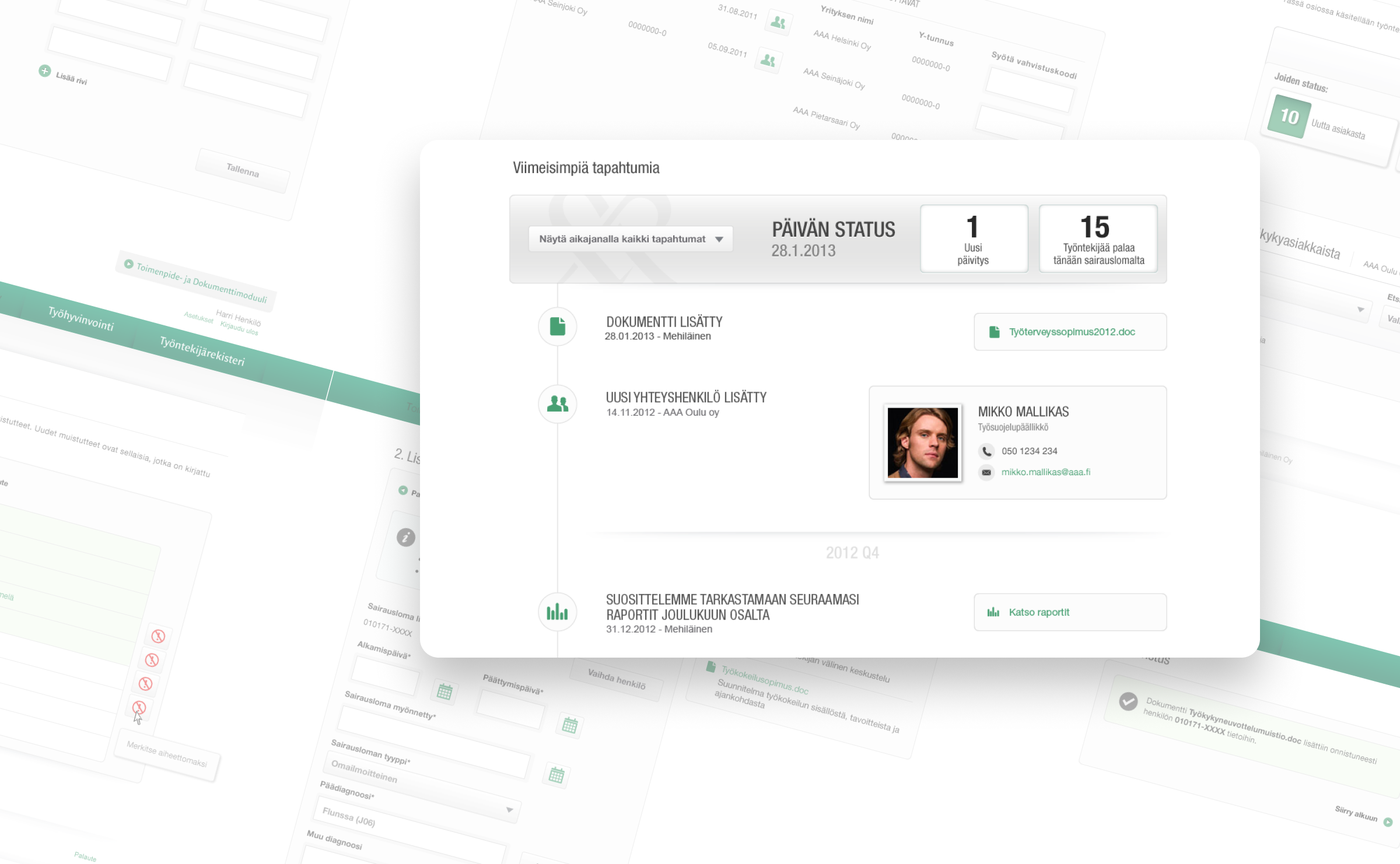
Mehiläinen runs occupational health services for companies across Finland. Our team designed the web service that HR teams actually use: a clean, professional interface that makes employee health tracking and reporting less of a chore.